

Design comparison

Solution retrospective
Here is my solution for Product Preview Page! I thought it was a simple one but the image was not that easy to deal with because of the mobile or desktop version.
Community feedback
- @VCaramesPosted about 2 years ago
Hey there! 👋 Here are some suggestions to help improve your code:
-
The purpose of the Main Element is to identify the main content of your page. It is not the container of you component. After the main element, you want add a container to wrap you separate components in.
-
The Alt Tag Description for the image needs to be improved upon. You want to describe what the image is; they need to be readable. Assume you’re describing the image to someone.
-
This challenges requires the use of two images 🎑 for different breakpoints. The Picture Element will facilitate this.
Here is an example of how it works: EXAMPLE
Syntax:
  <picture>
    <source media="(min-width: )" srcset="">
    <img src="" alt="">
  </picture>
More Info:
https://www.w3schools.com/html/html_images_picture.asp
https://web.dev/learn/design/picture-element/
-
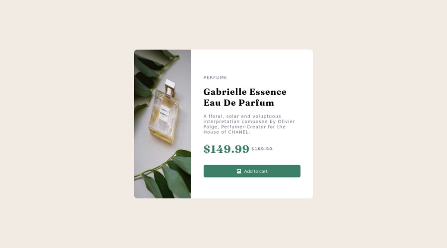
The only heading in this challenge is the name of the perfume, “Gabrielle Essence Eau De Parfum” . The rest of the text should be wrapped in a Paragraph Element.
-
The old price 🏷 is not being announced properly to screen readers. You want to wrap it in a Del Element and include span element with an sr-only text explaining that this is the old price.
If you have any questions or need further clarification, let me know.
Happy Coding! 👻🎃
Marked as helpful0 -
- @Raza7522Posted about 2 years ago
Here is the thing you can consider:
-
Instead of using 2 <img> tags you should use a <picture> tag:
<picture> <source media="(min-width: 960px)" srcset="./images/image-product-desktop.jpg"> <img src="./images/image-product-mobile.jpg" alt=""> </picture>
Here both images are given in a same tag one with a condition of min-width which will be displayed on that condition automatically.
- If all the content on the right side is enclosed in a div, it will be easier manage and align that.
Hope it helps.
1@ClaireLise-devPosted about 2 years ago@Raza7522 Thanks for your comment! I have tried this but it didn't work, I don't know why
1 -
- @Toch007Posted about 2 years ago
Great Job you did there. Not bad at all. As for the display I would advise you look at your html and CSS properly, especially the media query the min-width is supposed to be set at 374 but you set it at 960 or so. Try going through some good solutions on the platform and you may see the reason why your display is one sided. Thanks and have a nice time.
0@ClaireLise-devPosted about 2 years ago@Toch007 Thanks for your comment! The reason why I have a media query set at 960 is because I use the mobile first method that's why I have set the media query for desktop and not for mobile.
0 - @ClaireLise-devPosted about 2 years ago
I don't understand the screenshot issue with front end mentor, the screenshot on my solution doesn't fit my real solution. I have put a screenshot.jpg on my Github but still not looking good here. Doeas anyone knows why?
0


Please log in to post a comment
Log in with GitHub
Join our Discord community
Join thousands of Frontend Mentor community members taking the challenges, sharing resources, helping each other, and chatting about all things front-end!
Join our Discord