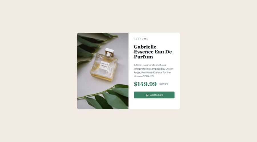
Design comparison
Community feedback
- P@RahexxPosted 5 months ago
Good job on this challenge!
I can see the improvements you’ve made in aligning your app closely with the design, creating a proper HTML structure, and writing clean styles in CSS. Your use of the
altattribute is excellent too.In your HTML file, you could consider replacing the
divwith the.cardclass with amaintag for better semantic structure, but the rest is well done. You’ve used custom properties effectively, which is great! In the future, try incorporating more variables for fonts and colors to make your styles even more reusable.One last piece of advice: if possible, test your app on larger screens, such as those wider than 1400px. Currently, when I open your app on a large screen, I notice that the height is increased, and the content in the right section only takes up half of the available height, leaving the other half empty. Next time, consider using
max-heightormax-widthto better control scaling on larger screens.Keep up the great work!
Marked as helpful0@jhenniiferPosted 5 months ago@Rahexx Hello, i have made the corrections you suggested, help me check they were done properly.
0P@RahexxPosted 5 months ago@jhenniifer Hi, I left a comment on GitHub regarding the commit you made—it looks great. Website looks great on bigger screens than 1400px. Excellent job on this!
One thing caught my attention: you are using a desktop-first approach. A more recommended approach is mobile-first, as it is often easier to manage in larger projects.
Here’s an article about Mobile First. If I remember correctly, I already sent you an article from CSS-Tricks, but here’s the link again: CSS-Tricks - Mobile First.
0
Please log in to post a comment
Log in with GitHubJoin our Discord community
Join thousands of Frontend Mentor community members taking the challenges, sharing resources, helping each other, and chatting about all things front-end!
Join our Discord
