

Design comparison

Solution retrospective
Using SASS for the first time felt good! This made it easier to read CSS variables. Was quite easy to setup together with Node.js.
It also felt good to go through the design section by section and feeling in control when implementing the design.
I did try a new CSS reset that I found which honestly made things more complicated and gave me more things to reset, ironically enough. So in the end I decided to stick with a basic CSS reset that just removed the default margins and paddings on elements, and set the same box-sizing on everything :)
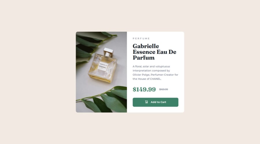
What challenges did you encounter, and how did you overcome them?The trickiest part by far was making the images responsive, and also swapping the images on desktop vs mobile. I am not sure I have done it in the best way though, but it seem that the images are shown as intended! I also spent some time to test the design in the browser on mobile resolutions and with different screen orientations and found some small bugs thanks to that, which I fixed.
What specific areas of your project would you like help with?Generally any best practices I should follow, in particular for handling the images. Also general feedback is always appreciated!
Community feedback
- @raficode2303Posted 11 months ago
Does the layout look good on a range of screen sizes? the site is almost 100% like the design 👍. good work.
- for some reason the site not work wekll as expected at Mozila Firefox browser
- need to add focus state for the add-to-cart button interactive element
improvements could be made:
-
try to use css ::before pseudo-element for adding the cart-icon instead using <img /> tag
-
try to use
<picture>atg with srcset attribute insted using 2<img>tags for the product image -
is better to use css
min-heightinsteadheightat .container class -
try to use CSS custom properties bonus: try to build it with css GRID instesd Flex
keep to build 👷
Marked as helpful0P@andiazPosted 10 months ago@raficode2303 Thanks for all the constructive feedback. Sorry for the late reply also, been working my way through Kevin Powell's course Conquering responsive layouts so that kept me busy for some time.
I've gone through all the feedback and done various updates for everything except the CSS grid part which I'll try out more in future challenges :)
Also thanks for pointing out that this didn't look that well in Firefox, this made me find a few additional issues in the CSS which I have fixed now! :)
1@raficode2303Posted 10 months ago@andiaz no need to Sorry. Kevin Powell is great, i follow him on YouTube. i'm sure that his course 'Conquering responsive layouts' is more than worth it. after you learned Javascript and became more Advanced, i recommend on Josh W. Comeau course: 'CSS for JavaScript Developers'. his site is Gold. Great Day.
Marked as helpful1P@andiazPosted 10 months ago@raficode2303 Awesome, thanks a lot! I added that course to my growing list of various courses I will go through eventually :)
0

Please log in to post a comment
Log in with GitHubJoin our Discord community
Join thousands of Frontend Mentor community members taking the challenges, sharing resources, helping each other, and chatting about all things front-end!
Join our Discord