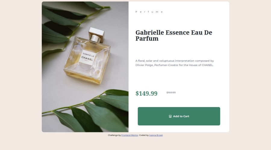
Design comparison
Solution retrospective
Overall, I think this was my fastest project yet (if you are only taking into account the amount of time that I spent coding). I am slowly improving with my understanding of positioning as well as semantic HTML meaning that this is getting easier for me to do.
What challenges did you encounter, and how did you overcome them?The attempt that you see is my second attempt at this project, I actually started this about two weeks ago but due to some big changes in personal circumstances I had to take a longer break than I wanted, when I managed to sit down again I struggled to get back into my workflow and started again due to the amount that I had managed to do before my upheaval. so I am looking into ways to improve my organization and workflow so it will hopefully be easier for me (or anyone else) to pick up where I left off
What specific areas of your project would you like help with?Does anyone have any tips for workflow and organization of their projects other than just committing more to Git Hub. is there an order that you like to work to help you focus or need to take a break for more than a day or so?
Community feedback
- @krishna-tejaswiPosted 10 months ago
It is good, the only isuue is line heigth. try to avoid using larger line heights. even if you use it try using px instead of rem
happy coding!
Marked as helpful0
Please log in to post a comment
Log in with GitHubJoin our Discord community
Join thousands of Frontend Mentor community members taking the challenges, sharing resources, helping each other, and chatting about all things front-end!
Join our Discord
