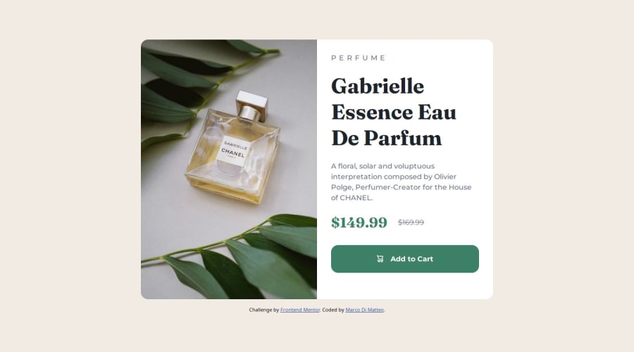
Design comparison
Community feedback
- P@StroudyPosted 7 months ago
Hello again friend, Fantastic effort on this again! You’re really nailing it. Just a few things I noticed that could make it even better…
-
This should be in lowercase
<h2>PERFUME</h2>and styled in CSS withtext-transform: uppercase;, Keeping text lowercase in HTML improves accessibility and SEO. Usingtext-transform: uppercase;in CSS separates content from style, ensuring screen readers interpret the text correctly. -
I think you can benefit from using a naming convention like BEM (Block, Element, Modifier) is beneficial because it makes your CSS more organized, readable, and easier to maintain. BEM helps you clearly understand the purpose of each class, avoid naming conflicts, and create reusable components, leading to a more scalable codebase. For more details BEM,
-
This does not matter that much at this stage but something to be mindful of for SEO(Search Engine Optimisation),
<meta>description tag missing that helps search engine determine what the page is about, Something like this<meta name="description" content="description goes here" /> -
Using
remoremunits in@mediaqueries is better thanpxbecause they are relative units that adapt to user settings, like their preferred font size. This makes your design more responsive and accessible, ensuring it looks good on different devices and respects user preferences.
I hope you found this advice helpful! Keep up the great work, You’re doing amazing, and I can’t wait to see what you create next. Happy coding! 🚀
0 -
Please log in to post a comment
Log in with GitHubJoin our Discord community
Join thousands of Frontend Mentor community members taking the challenges, sharing resources, helping each other, and chatting about all things front-end!
Join our Discord
