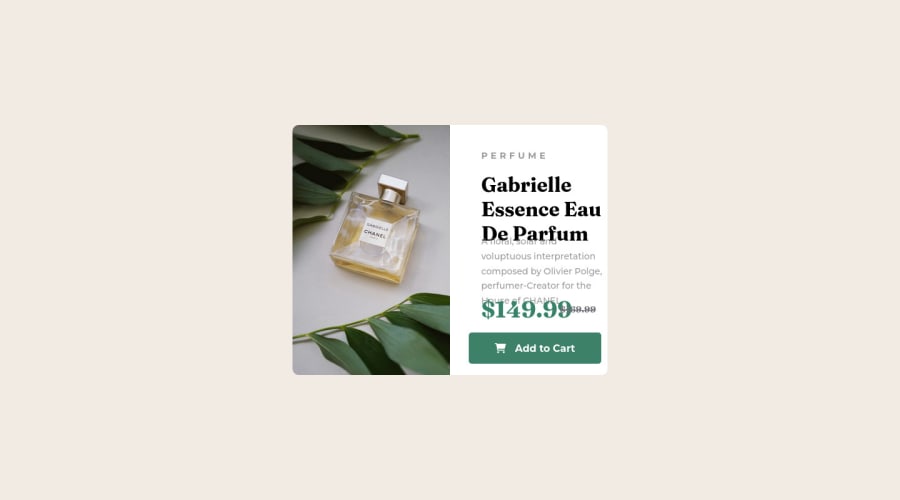
Design comparison
Solution retrospective
I'm still getting to grips with HTML & CSS and how to achieve desired results properly. I'm interested to know if I have approached this correctly and if the methods i'm using are correct, specifically around giving everything a position: absolute and then moving it around with top, bottom, left, right...
Also the screenshot at the top of this page (the slider to compare) isn't accurate of the actual page and the text is deformed - does this indicate this isn't good?
Thanks
p.s - no mobile site, haven't ventured into media queries yet
Community feedback
- @MelvinAguilarPosted about 2 years ago
Hi @Earpz1 ๐, good job completing this challenge, and welcome to the Frontend Mentor Community! ๐
Here are some suggestions you might consider:
- Centering the element with position would make your element behave strangely on some mobile devices. There are two modern CSS techniques to center elements instead of using the position property:
Using flexbox layout:
body { width: 100%; min-height: 100vh; display: flex; flex-direction: column; justify-content: center; align-items: center; }
Using grid layout:
body { width: 100%; min-height: 100vh; display: grid; place-content: center; }
Links with more information:
- The Complete Guide to Centering in CSS.
- A Complete Guide to Flexbox (CSS-Tricks).
- How TO - Center Elements Vertically (W3Schools).
- CSS Layout - Horizontal & Vertical Align (W3Schools).
.
- In this challenge, you should not use the background property to set the image because this image has semantic meaning. Use the CSS background property if the image is not part of the content. You can use a <picture> tag when you need to change an image in different viewports. Using this tag will prevent the browser from loading both images, saving bandwidth and preventing you from utilizing a media query to modify the image.
Example:
<picture> <source media="(max-width: 460px)" srcset="./images/image-product-mobile.jpg"> <img src="./images/image-product-desktop.jpg" alt="your_alt_text"> </picture>
Remove all position properties:
body { margin: 0; background-color: hsl(30, 38%, 92%); /* width: 1440px; */ font-family: 'Fraunces', serif; display: flex; justify-content: center; align-items: center; min-height: 100vh; } .card-container { /* position: absolute; */ /* top: 0; */ /* bottom: 0; */ /* right: 0; */ /* left: 0; */ /* width: 35%; */ /* height: 50%; */ /* top: 50%; */ /* left: 50%; */ /* transform: translate(-50%, -50%); */ max-height: 465px; background-color: white; border-radius: 10px; overflow: hidden; display: flex; max-width: 640px; } img { /* Use this to make responsive images*/ width: 100%; height: 100%; object-fit: cover; } .text-container { flex: 50%; /* Update with 2 flex columns*/ /* position: absolute; */ /* width: 50%; */ /* height: 100%; */ /* left: 50%; */ padding-left: 50px; } .left-image { flex: 50%; /* Update with 2 flex columns*/ /* position: absolute; */ /* width: 50%; */ /* height: 100%; */ /* background-image: url(images/image-product-desktop.jpg); */ /* background-size: cover; */ /* background-repeat: no-repeat; */ /* background-position: center center; */ } .text-container .perfume { /* position: absolute; */ /* top: 10%; */ font-family: 'Montserrat', sans-serif; font-size: 14px; font-weight: 700; letter-spacing: 5px; color: #6f7175; opacity: 70%; } h1 { /* position: absolute; */ /* top: 10%; */ padding-top: 15px; } .text-container .description { /* position: absolute; */ /* top: 40%; */ font-family: 'Montserrat', sans-serif; font-size: 14px; color: #6f7175; opacity: 70%; padding-right: 50px; line-height: 1.7; } .price-container { /* position: absolute; */ display: inline-block; /* top: 68%; */ color: #378368; font-size: 2.3rem; font-weight: 700; } .old-price { /* position: relative; */ display: inline-block; padding-bottom: 20px; /* left: 50%; */ /* top: 71%; */ color: #6f7175; font-size: 0.9rem; font-weight: 500; text-decoration: line-through; }
I hope those tips will help you.
Good job, and happy coding!
Marked as helpful1
Please log in to post a comment
Log in with GitHubJoin our Discord community
Join thousands of Frontend Mentor community members taking the challenges, sharing resources, helping each other, and chatting about all things front-end!
Join our Discord