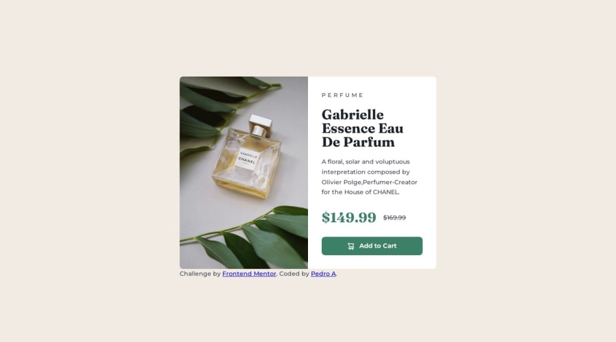
Design comparison
SolutionDesign
Solution retrospective
Any feedback is good? trying to work more with CSS
Please log in to post a comment
Log in with GitHubCommunity feedback
- @fernandolapaz
Hi, just a little tip if you allow me:
- It is better to use
min-heightfor the body, as usingheightcauses the page to be cut off in viewports with small height (such as mobile landscape orientation).
I hope it’s useful 🙂
Regards 👋,
Marked as helpful - It is better to use
Join our Discord community
Join thousands of Frontend Mentor community members taking the challenges, sharing resources, helping each other, and chatting about all things front-end!
Join our Discord
