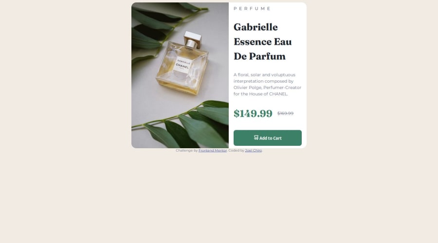
Design comparison
Solution retrospective
I am proud that I am able to take on more challenges with ease.
What challenges did you encounter, and how did you overcome them?I am still getting to understand how flexbox works and all of its constraints. Web.dev helped me out a lot.
What specific areas of your project would you like help with?I am new to CSS, and finding they right way to go about learning is key. Some parts I meet that I am green to can be quite challenging. I have an overall understanding, yet to get in depth.
Community feedback
- @R3ygoskiPosted 12 months ago
Hello again @1deadjoe, congratulations on completing another challenge.
Here's a tip, to center your card, put this in the
body:display: flex; justify-content: center; align-items: center; flex-direction: column; height: 100vh;If you do this, you can remove everything related to flex from the
main, including themargin.Now, a tip related to semantics, the name of the perfume should be the
<h1>, as it is the main part of the entire page, while "perfume" is a category, so it should be the<h2>.Still on semantics, it would be more correct for
<div class="content">to be an<article>, as the content within it is self-explanatory.And again, good job, keep practing and improving your skill, if you need some help, please comment below.
Marked as helpful0
Please log in to post a comment
Log in with GitHubJoin our Discord community
Join thousands of Frontend Mentor community members taking the challenges, sharing resources, helping each other, and chatting about all things front-end!
Join our Discord
