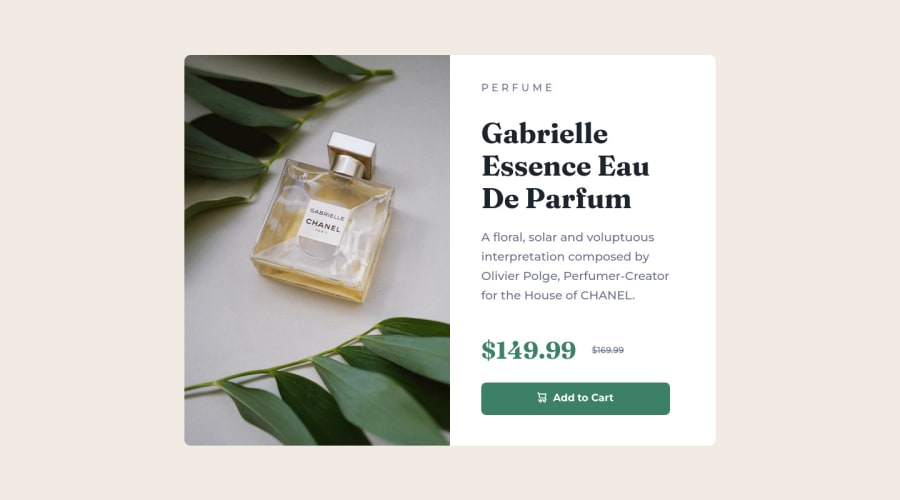
Design comparison
Solution retrospective
Made updates from previous comments. Any feedback would be helpful! Thanks!
Community feedback
- Account deleted
Hey @bh-codes, some suggestions to improve you code:
-
You forgot to add
min-height: 100vh;to your Body Element to center your content. -
For this challenge you want to use the Picture Element not the Background Image Property. The Background Image Property is mainly used on decorative images NOT images that add value and serve a purpose.
Picture Element will allow your to switch between images in different breakpoints and makes your site load faster by saving bandwidth.
- Syntax:
  <picture>
    <source media="(min-width: )" srcset="">
    <img src="" alt="">
  </picture>
Source:
https://www.w3schools.com/html/html_images_picture.asp
https://web.dev/learn/design/picture-element/
-
Once you fix the image implementation, you'll want to include an Alt text tag with them. Inside that Alt Tag you want to describe what the image is; they need to be readable. Assume you’re describing the image/icon to someone.
-
There is only one heading in this challenge and that is the name of the perfume, “Gabrielle Essence Eau De Parfum”.
-
The old price is not being announced properly to screen readers. You want to wrap it in a Del Element and include a sr-only text explaining that this is the old price.
Happy Coding! 👻🎃
Marked as helpful0 -
- @amulyalovescodingPosted over 2 years ago
Hello Betty H, Congratulations on completing this challenge! I really liked the result of your project, but I have some tips that I like to share:
1- Every page should have one main landmark <main>. So replace the div that wraps the whole content with <main> to improve the accessibility. click here
2- All page content should be contained by landmarks, you can understand better by clicking here: click here
As you already make the corner rounded, so no need to repeat.
✌️ I hope this helps you. Happy Coding.
Marked as helpful0 - @dquindara8Posted over 2 years ago
Hello Betty,
You make curved corners by using the border-radius: property in CSS. First, you must create a BORDER by specifying the width, style and color such as: border: 1px solid red;
You need not use all 3 values but you must specify the style. Then you add border radius like so: border-radius: 2px; border-radius: 25px;
0
Please log in to post a comment
Log in with GitHubJoin our Discord community
Join thousands of Frontend Mentor community members taking the challenges, sharing resources, helping each other, and chatting about all things front-end!
Join our Discord
