

Design comparison
SolutionDesign

Solution retrospective
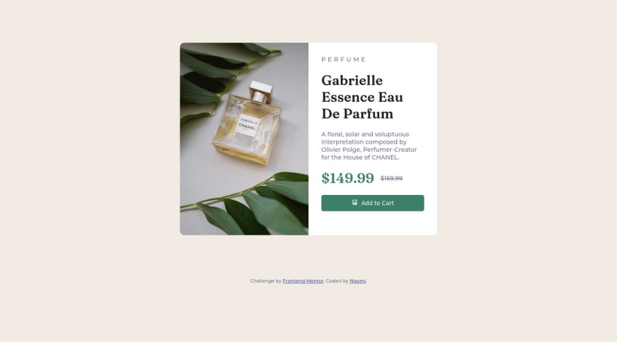
This is my first challenge, so please let me know if you have feedback on better practices. I struggled with filling the image in correctly to the containers width as well as a small gap in between the image and the white container with the info. I figured it out but unsure on the why. Also, unsure on best practice for switching image for mobile vs desktop.
Community feedback
Please log in to post a comment
Log in with GitHub
Join our Discord community
Join thousands of Frontend Mentor community members taking the challenges, sharing resources, helping each other, and chatting about all things front-end!
Join our Discord