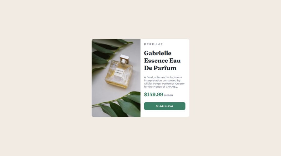


Design comparison

Solution retrospective
Next time, I'll try to do mobile-first design.
What challenges did you encounter, and how did you overcome them?1 - I want to learn the best practices to create a responsive website. 2 - Make sure my code is clean.
Please log in to post a comment
Log in with GitHubCommunity feedback
- P@danielmrz-dev
Hello @SamahTT!
Your project looks great!
I have a suggestion about your code that might interest you:
📌 You can use the
<picture>tag when you have different versions of the same image.Using the
<picture>tag will help load the correct image to the user's device, saving bandwidth and improving performance.Example:
<picture>
    <source media="(min-width: 768px)" srcset="{desktop image path here}">
    <img src="{mobile image path here}" alt="{alternative text here}">
</picture>
I hope this helps!
Other than that, excellent work!
Marked as helpful - @0xabdulkhaliq
Hello there 👋. Congratulations on successfully completing the challenge! 🎉
- I have a suggestion regarding your code that I believe will be of great interest to you.
COMPONENT MEASUREMENTS 📐:
- The
width: 100%property for.containeris not necessary. because it's a block level element which will take the full width of the page by default.
- So feel free to remove
width: 100%style rule from.containerthis will help you to write efficient code and makes your code more reusable.
.
I hope you find this helpful 😄 Above all, the solution you submitted is great !
Happy coding!
Marked as helpful


Join our Discord community
Join thousands of Frontend Mentor community members taking the challenges, sharing resources, helping each other, and chatting about all things front-end!
Join our Discord