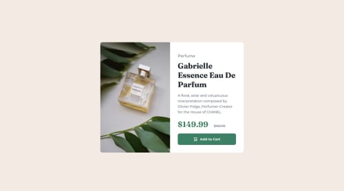
Submitted over 1 year agoA solution to the Product preview card component challenge
Product Preview Card
P
@acandael

Solution retrospective
What are you most proud of, and what would you do differently next time?
I'm proud of using the Picture element for this challenge.
What challenges did you encounter, and how did you overcome them?I had trouble getting the layout right for desktop. For some reason the Picture element wouldn't scale to 50%. The only way I could fix it was by setting the image element to 60% and the content div to 50%.
What specific areas of your project would you like help with?I could use some feedback on how to make the images responsive.
Code
Loading...
Please log in to post a comment
Log in with GitHubCommunity feedback
No feedback yet. Be the first to give feedback on Anthony Candaele's solution.
Join our Discord community
Join thousands of Frontend Mentor community members taking the challenges, sharing resources, helping each other, and chatting about all things front-end!
Join our Discord