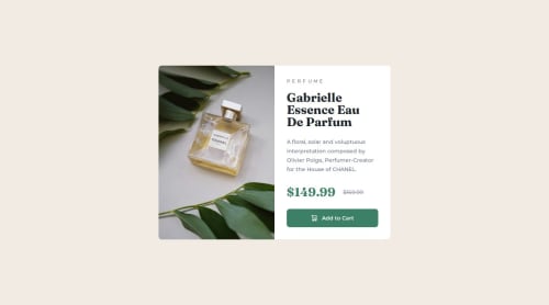
Submitted about 1 year agoA solution to the Product preview card component challenge
Product Preview Card
tailwind-css
@jboys

Solution retrospective
What are you most proud of, and what would you do differently next time?
Took a mobile-first approach. I probably overcomplicated the solution to get closer to the target design — next time, I would find a happier medium between simplicity and fidelity.
What challenges did you encounter, and how did you overcome them?I had to refer to the Tailwind docs a few times for this challenge.
What specific areas of your project would you like help with?Mainly relating to my use of Tailwind:
- Is my use of utility classes appropriate and efficient?
- Are there any unnecessary or redundant classes that could be cleaned up?
Code
Loading...
Please log in to post a comment
Log in with GitHubCommunity feedback
No feedback yet. Be the first to give feedback on Josh Boys's solution.
Join our Discord community
Join thousands of Frontend Mentor community members taking the challenges, sharing resources, helping each other, and chatting about all things front-end!
Join our Discord