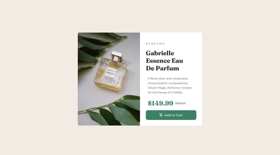
Design comparison
SolutionDesign
Solution retrospective
What are you most proud of, and what would you do differently next time?
Being able to insert background images and cleared original html image using visibility and overflow hidden
What challenges did you encounter, and how did you overcome them?My challenge was the desktop screen sizing i.e. horizontal layout which is the flex-row;
What specific areas of your project would you like help with?Am still not that good in css framework but am a pure css person
Community feedback
- @eros77scPosted about 1 month ago
Hi!
Great job on creating another page! Here are a few small things I noticed about your code:
- Good idea using
background-image; another possibility could have been to use the<picture>element, allowing the browser to choose the ideal image depending on the size, which would help reduce the amount of code needed for properties likevisibilityandbackground. - One tip you might want to apply is about the visual organization of your code: try to maintain consistent indentation for selectors, properties, and values. This makes it easier to read and locate information. The same applies to the spacing between each CSS rule.
- The button could be created with a
<button>element instead of<div class="button">, as it not only makes the HTML more semantic but also more accessible. In the end, it allows for the same CSS styling. - You mentioned that scaling for desktop was a challenge, but you did a great job! And the mobile version looks really good too.
Happy coding, take care!
Marked as helpful0@manuel360Posted about 1 month ago@eros77sc thanx very much for the advice and contributions.
0 - Good idea using
Please log in to post a comment
Log in with GitHubJoin our Discord community
Join thousands of Frontend Mentor community members taking the challenges, sharing resources, helping each other, and chatting about all things front-end!
Join our Discord
