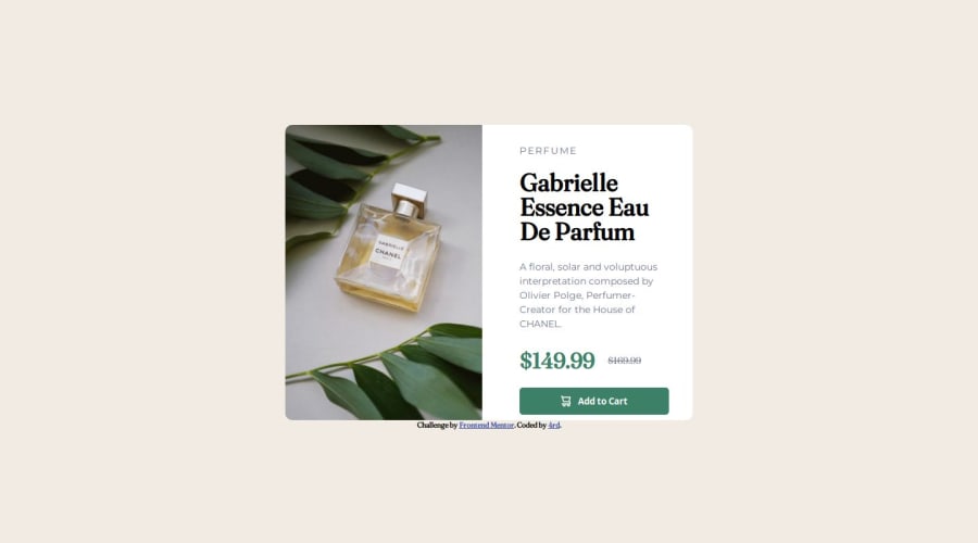
Design comparison
SolutionDesign
Solution retrospective
What are you most proud of, and what would you do differently next time?
I am most proud of learning about mobile first design and using it in a project.
What challenges did you encounter, and how did you overcome them?I had many challenges with the font and making the design.
Community feedback
- @jeremymouzinPosted 5 months ago
Well done!
The design may be improved though:
- Missing padding at the bottom of the content on the right, below the button
- Too much padding around the text
- The font weight of the title doesn't seem right
- You could use letter-spacing on the Perfume line
0
Please log in to post a comment
Log in with GitHubJoin our Discord community
Join thousands of Frontend Mentor community members taking the challenges, sharing resources, helping each other, and chatting about all things front-end!
Join our Discord
