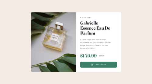
Submitted over 3 years agoA solution to the Product preview card component challenge
Product Preview Card
sass/scss
@K-Zimny

Solution retrospective
I wanted a fully responsive layout incase the height of the text blocks changed in the future (future proofing). However, the height of the img kept exceeding the height of the text content container. I wrote some JS to handle this by getting the size of the text content container and applying it to the image.
Did anyone else struggle with something similar?
Code
Loading...
Please log in to post a comment
Log in with GitHubCommunity feedback
No feedback yet. Be the first to give feedback on Ken Zimny's solution.
Join our Discord community
Join thousands of Frontend Mentor community members taking the challenges, sharing resources, helping each other, and chatting about all things front-end!
Join our Discord