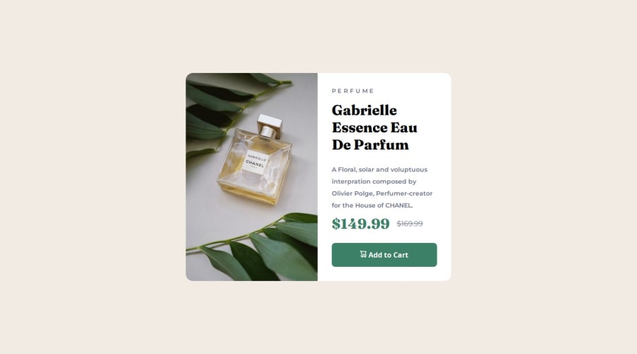
Design comparison
Solution retrospective
I'm glad I finished this stage of the challenge
What challenges did you encounter, and how did you overcome them?I faced challenges with using clamp() units for sizes, adjusting images for mobile and desktop versions, and configuring flex in this project.
Please log in to post a comment
Log in with GitHubCommunity feedback
- P@MikDra1
If you want to make your card responsive with ease you can use this technique:
.card {
width: 90%;
max-width: 37.5rem;
}
On the smaller screens card will be 90% of the parent (here body), but as soon as the card will be 37.5rem (600px) it will lock with this size.
Also to put the card in the center I advise you to use this code snippet:
.container {
display: grid;
place-items: center;
}
Hope you found this comment helpful 💗💗💗
Good job and keep going 😁😊😉
Marked as helpful - @Grimm-N
Fantastic job on the code, you nailed it! 🎉 I have just a tiny suggestion that might make it even better. You could try adding a small margin to the card container so that it’s fully visible on mobile without needing to scroll. Or, if you're feeling adventurous, adjusting the
heightto90vhmight ensure the whole design is visible no matter what screen size you're working with.Keep up the great work!
Marked as helpful
Join our Discord community
Join thousands of Frontend Mentor community members taking the challenges, sharing resources, helping each other, and chatting about all things front-end!
Join our Discord
