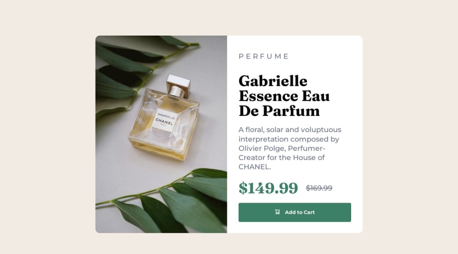
Design comparison
Solution retrospective
What I learned I learned how to use the picture and hgroup HTML elements. I also used mobile first using media query for the first time. I set up the mobile version first, then tweaked for desktop, then had to go back and tweak some mobile CSS again.
Continued development I feel like the code is a mess, but I was happy with my overall "approach" to the project, breaking down the html classes in a separate doc to make sure I was clear on them all before beginning the CSS. I still think I have a lot to learn as far as HTML & CSS go - especially with the bigger picture concerns like how to think forward for extensibility - but I really haven't learned much about these ideas yet. I'm about 2 weeks into my front end dev learning process. I'm at the beginning, so there's a lot more to learn.
Useful resources & Acknowledgments How to plan your HTML (1): Product Preview Card - This helped me structure the divs and learn the bigger picture approach to a project. Also great tips on using the A friend of mine also helped me troubleshoot sizing for the 2 halves of the desktop version. (Varin)
Community feedback
Please log in to post a comment
Log in with GitHubJoin our Discord community
Join thousands of Frontend Mentor community members taking the challenges, sharing resources, helping each other, and chatting about all things front-end!
Join our Discord
