

Design comparison

Solution retrospective
- How do I make this website according to mobile design?
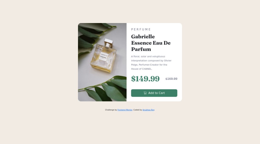
- How do I pull up the strike through price so it is inline with the bold price as given in the design for desktop
Please log in to post a comment
Log in with GitHubCommunity feedback
- @amulyalovescoding
Hello Anubhav Ray, Congratulations on completing this challenge! I really liked the result of your project, but I have some tips that I like to share:
1- Every page should have one main landmark <main>. So replace the div that wraps the whole content with <main> to improve the accessibility. click here
2- All page content should be contained by landmarks, you can understand better by clicking here: click here
Q. How do I make this website according to mobile design?
=>Use the media query property to layout according to mobile design and modify the max width that you want the styles to take effect. It will allow you to modify component's property accordingly.
example-
@media only screen and (max-width: 600px) {
  body {
    background-color: lightblue;
  }
}
Q. How do I pull up the strike through price so it is inline with the bold price as given in the design for desktop
=>
<div class="textalign">
    <span class="span1">$149.99 </span>
  <span class="span2"><s>$169.99</s></span>
  </div>
css-
.textalign {
    text-align: left;
    display: flex;
    align-items: center;
}
You can go through my solution if you like click here
✌️ I hope this helps you. Happy Coding.
Marked as helpful - @Nondaba
Hey, @Anubhav Ray. Congrats on finishing the projects, you did a really good job.
- Use the media query property to layout according to mobile design and stipulate the max width at which you want the styles to take effect. There you can apply your styles to classes or elements to fit mobile size.
- Try using position property, set it to relative and top property assign it a negative value to move the strike through price up.
I hope this helps. Happy coding👍.
- @Ayodelearog
Hi, you can put both prices in a div and make it a flexbox, then you align-items and justify-content. That should help you center them.


Join our Discord community
Join thousands of Frontend Mentor community members taking the challenges, sharing resources, helping each other, and chatting about all things front-end!
Join our Discord