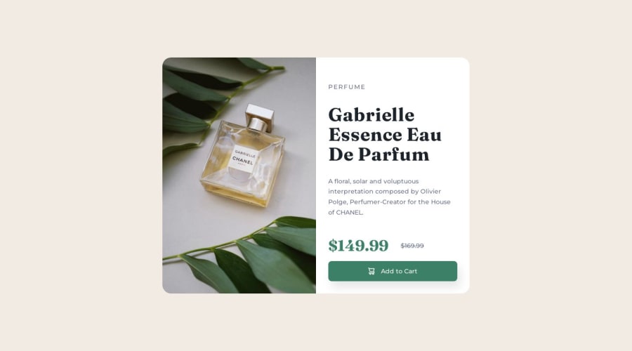
Design comparison
Solution retrospective
This should be a very easy challenge, and yet I'm still struggling to get the mobile image displayed correctly! Please help!
I know it is to do with the height, but I tried everything I could think of and still can't get it right. How do I modify the height on mobile view to show the image correctly?
.card-container {
    display: grid;
    place-content: center;
    grid-template-columns: 1fr 1fr;
    max-width: 50rem;
    height: minmax(auto, 40rem);
    overflow: hidden;
    border-radius:20px;
}
Thank you!
Community feedback
- @MelvinAguilarPosted over 1 year ago
Hello there 👋. Good job on completing the challenge !
I have some suggestions about your code that might interest you.
- How do I modify the height on mobile view to show the image correctly? r/ Prefer
min-height: 100vhoverheightin<body>to avoid cutting off content on smaller screens like mobile phones.
HTML 🏷️:
- The product image isn't decorative. Use the
<img>tag for it, not thebackground-imageproperty. Reservebackground-imagefor decorative visuals without informative value.
I hope you find it useful! 😄 Above all, the solution you submitted is great!
Happy coding!
Marked as helpful2 - How do I modify the height on mobile view to show the image correctly? r/ Prefer
Please log in to post a comment
Log in with GitHubJoin our Discord community
Join thousands of Frontend Mentor community members taking the challenges, sharing resources, helping each other, and chatting about all things front-end!
Join our Discord
