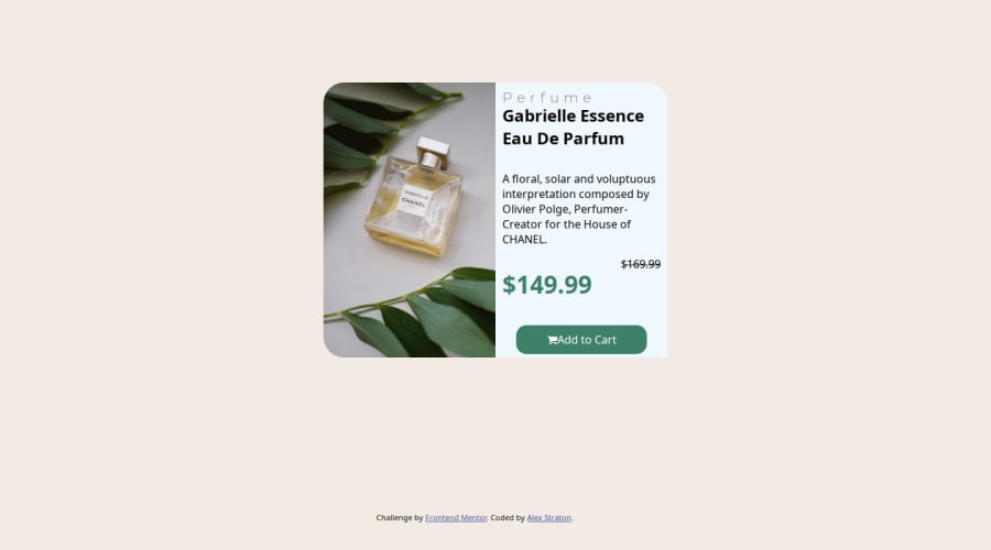
Design comparison
Solution retrospective
I am proud of how I aligned the elements in their own containers and I am getting the hang of styling parent and child elements depending on which containers they are in.
What challenges did you encounter, and how did you overcome them?Again, responsiveness, I understand how to use the media query but I have to style it manually as the screen goes to mobile.
What specific areas of your project would you like help with?Responsiveness when you use the dev tools in the browser. Which pixel size should I use?
Community feedback
- @Cristiano-Miguel-DCodeMasterPosted about 1 year ago
Hi there! I'm really happy because you have successfully completed a frontendmentor challenge🎯🤝
Here's a tip that you might be interested in solving:
- responsiveness issues: next time try to focus in a responsive layout for different sizes, take a look in smaller devices(mobile) and laptops. You can use the developers tools in your browser.
Happy coding👌🎯🤝
0
Please log in to post a comment
Log in with GitHubJoin our Discord community
Join thousands of Frontend Mentor community members taking the challenges, sharing resources, helping each other, and chatting about all things front-end!
Join our Discord
