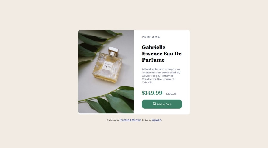
Design comparison
Solution retrospective
I learned a few new things with this project, such as how to change the img when viewed via desktop or mobile, and also learned how to eyeball sizes through Adobe Photoshop, since I didn't have the Figma design file. I'd follow the challenges for next time and try to use SASS to compile my CSS, and also try to record the amount of time it took to finish this project.
What challenges did you encounter, and how did you overcome them?I worked on this project without the help of the Figma design file, so the sizing probably isn't exact. I had most trouble with figuring out how to make the img responsive, but I managed to solve it through CSS instead of using an img tag in the html file.
What specific areas of your project would you like help with?I keep getting a small amount of white space between the bottom of the img and the end of the product card when viewed via desktop. I'd like to know how others went about planning the height of their product card, and if they used px or a more responsive unit of measurement.
Join our Discord community
Join thousands of Frontend Mentor community members taking the challenges, sharing resources, helping each other, and chatting about all things front-end!
Join our Discord
