


@MelvinAguilar
Posted
Hello 👋. Congratulation on successfully completing your first challenge 🎉 ! !
I have other recommendations regarding your code that I believe will be of great interest to you.
HTML 📄:
-
You could use the
<del>tag to indicate the price that was before the discount. It is typically displayed with a line through the text, indicating that it has been removed. Additionally, you can use asr-onlyclass to describe the discount. This will help screen reader users to understand that the price was discounted.Example:
<del><span class="sr-only">Old price: </span>$169.99</del>
- The
altattribute is used to provide a text description of the image which is useful for screen reader users, assistive technology users, and search engine optimization. Add thealtattribute to the<img>tag of the product.
CSS 🎨:
- You should use the
cursor: pointerproperty to indicate that the element like a button or a link is clickable.
-
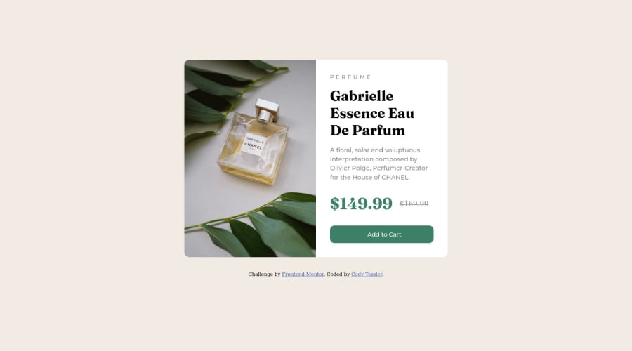
I currently have two issues with your solution: the image is not perfectly distributed on desktop computers, and the solution is cut off on mobile devices.
I have the following suggestions to fix these problems:
- The best way to create two columns in CSS is to use the grid layout 📐.
Using the grid layout, you can create two columns by setting the display property of the parent element to grid and then defining the number of columns you want with the
grid-template-columnsproperty.
-
Setting a defined
heightfor the card component is not recommended. The content should define the component height, otherwise, it will not be allowed to extend beyond your specifications. Alternatively, you can usemin-height.result:
.card-container {
    display: grid;
    grid-template-columns: 1fr 1fr; /* NOTE: Using grid layout to create two columns */
    max-width: 600px;
    min-height: 450px; /* NOTE:  use min-height instead of max-height */
    background-color: hsl(0, 0%, 100%);
    margin: 2rem;
    border-radius: 1rem;
    overflow: hidden;
}

img {
    /* max-height: 100%; */
    /*  NOTE: This makes the image fit the component regardless of size. */
    height: 100%;
    width: 100%;
    display: block;
}

@media only screen and (max-width: 600px)
.card-container {
    /* display: flex; */
    /* flex-direction: column; */
    /* margin: 5%; */
    /* max-height: 75%; */
    grid-template-columns: 1fr;
}
I hope you find it useful! 😄 Above all, the solution you submitted is great!
Happy coding!
Marked as helpful
@cjtessler
Posted
@MelvinAguilar Thank you! The comments about height were helpful! I pushed a fix for the mobile design based on your feedback.
I have more practice with flex, so I tend to default to it. But - I can see why grid would be a cleaner choice here.

