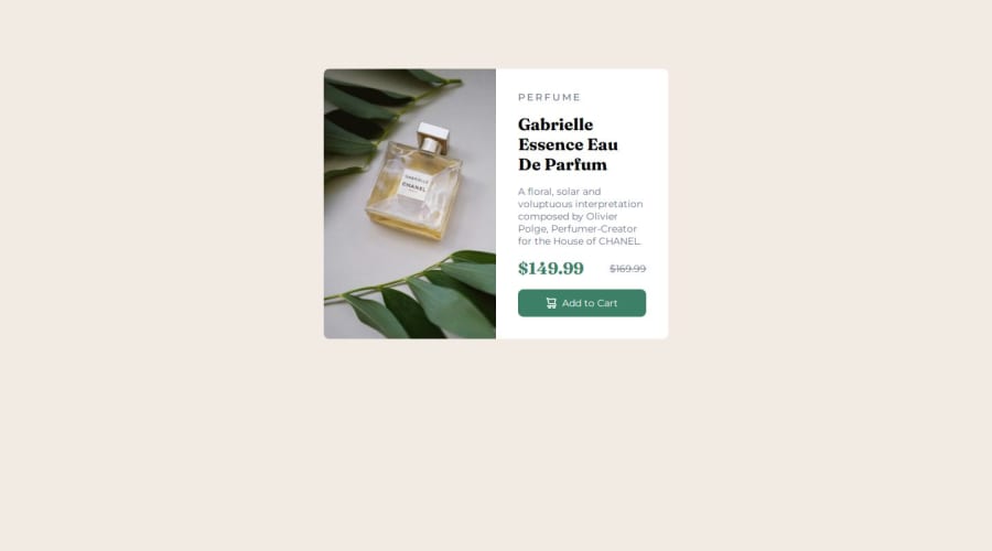
Design comparison
SolutionDesign
Community feedback
- @Hasani-SediqaPosted 5 months ago
The style looks good, i think you can change the height of the card.
Marked as helpful0 - @hrid-chakrabortyPosted 5 months ago
Awesome work!! The card looks great!!
I have a few observations/suggestions which I hope will help you:
- For the body style, the
min-widthhas been set to 100vh instead of 100vw (maybe a typo). Setting this to 100vw makes it much more responsive.
The affected code block:
body { min-width: 100vh; // Change this to 100vw display: flex; align-items: center; justify-content: center; background-color: var(--Cream); }- It is recommended to use semantic html (eg.
<article>,<header>etc.) over plain<div>and<span>as it offers more meaning and has several benefits:
- It helps search engines index the content properly.
- It also enables screen readers and other assistive technologies to communicate elements properly to the user.
0 - For the body style, the
Please log in to post a comment
Log in with GitHubJoin our Discord community
Join thousands of Frontend Mentor community members taking the challenges, sharing resources, helping each other, and chatting about all things front-end!
Join our Discord
