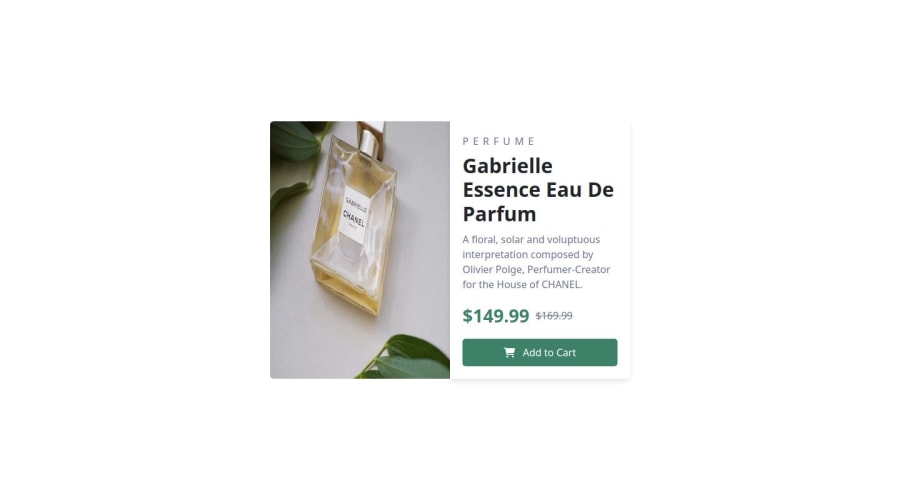
Design comparison
Solution retrospective
I’m most proud of successfully completing the project within the deadline and delivering a clean, user-friendly design. If I could do it differently, I would allocate more time for testing and performance optimization. Overall, I learned the importance of flexibility and improving my workflow.
What challenges did you encounter, and how did you overcome them?I encountered challenges with optimizing performance and ensuring responsive design across various devices. To overcome this, I used tools like image compression and media queries for better scaling. Additionally, I researched best practices and implemented iterative testing to resolve issues efficiently.
What specific areas of your project would you like help with?I would like help with optimizing my code for performance, particularly with improving load times for media-heavy pages. I'm also looking for feedback on how to streamline my CSS structure and make it more maintainable. Any advice on advanced responsive design techniques for better mobile usability would be greatly appreciated
Community feedback
- @Lo-DeckPosted 3 months ago
Hi well done for this challenge,
First of all, don't use a lot of
divwhen you can use other element likesection,p, It's better for screen reader and SEO.You can use picture tag to display different image depending on the size. Here a link : MDN.
<picture>
  <source media="(max-width: 799px)" srcset="your path" >
  <source media="(min-width: 800px)" srcset="your path" >
  <img src="your path" alt="your description" >
</picture>
It's better to use
emorreminstead ofpx. FreeCodeCamp.Hope to be helpful.
0
Please log in to post a comment
Log in with GitHubJoin our Discord community
Join thousands of Frontend Mentor community members taking the challenges, sharing resources, helping each other, and chatting about all things front-end!
Join our Discord
