

Design comparison

Community feedback
- @0xabdulkhaliqPosted almost 2 years ago
Hello there 👋. Congratulations on successfully completing the challenge! 🎉
- I have other recommendations regarding your code that I believe will be of great interest to you.
PiCTURE TAG 📸:
- Looks like you're currently using single image for both Desktop & Mobile devices, but we want to swap images according to their screen sizes. Luckily there's a native html element which may help us to achieve this method without need of css
- So let me introduce the
pictureelement.
- The
<picture>tag is commonly used for responsive images, where different image sources are provided for different screen sizes and devices, and for art direction, where different images are used for different contexts or layouts.
- Example:
<picture>
<source media="(max-width: 768px)" srcset="small-image.jpg">
<source media="(min-width: 769px)" srcset="large-image.jpg">
<img src="fallback-image.jpg" alt="Example image">
</picture>
- In this example, the
<picture>tag contains three child elements: two<source>elements and an<img>element. The<source>elements specifies different image sources and the conditions under which they should be used.
- Using this approach allows you to provide different images for different screen sizes without relying on CSS, and it also helps to improve page load times by reducing the size of the images that are served to the user
- If you have any questions or need further clarification, you can always check out
my submissionand/or feel free to reach out to me.
.
I hope you find this helpful 😄 Above all, the solution you submitted is great !
Happy coding!
Marked as helpful0 - @charlesmamboPosted almost 2 years ago
Hi, I hope you doing well, I was going through your project and I have a few suggestions.
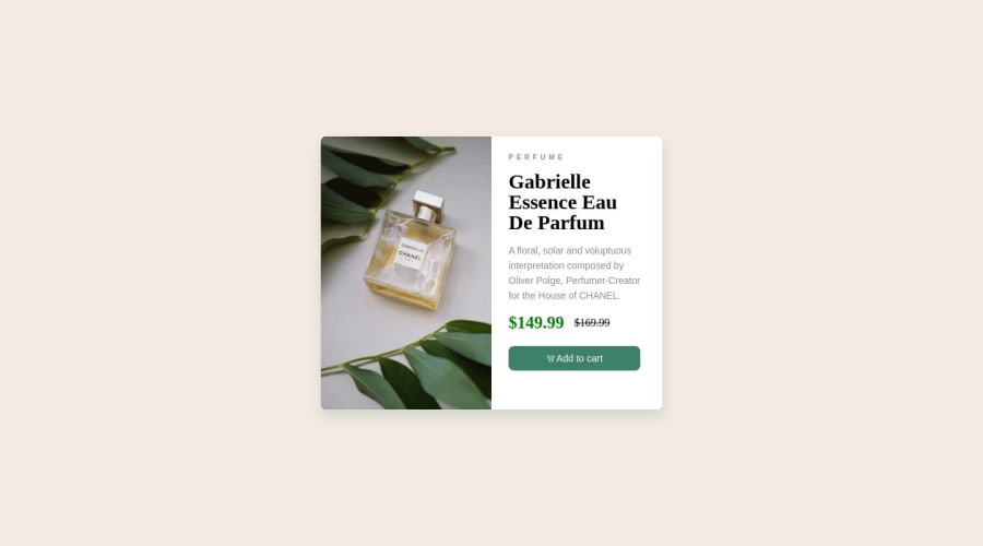
<p style="letter-spacing: 5px; font-size: 10px; font-weight: 600; color: rgb(138, 138, 138)">PERFUME</p> I don`t think necessary to inline CSS since you have got CSS external folder. just try to use external CSS so that you can keep your code clean or if you want to change a certain area of your code and they do not change using classes you switch to ids.And here
<div class="price"> <p class="currentprice">$149.99</p> <p class="previousprice">$169.99</p> </div> your code is okay but you can simply achieve this by using a <span> like so <p class="currentprice">$149.99 <span>$169.99</span></p> if you want to add some changes to that text just give your span tag a class and edit on your CSS.And here .right{ height: 100%; width: 250px; background: white; border-radius: 8px; padding: 25px;
} Be really careful when giving your height and width values, do not pixels and percentage. if you are going to use pixels just sticky with the pixels, but I encourage you to use percentages, not pixels and let`s say you give your height:20%; make sure your width is also width: 20%;
Other than that everything is good #keep going
let me know if this helped
Marked as helpful0


Please log in to post a comment
Log in with GitHub
Join our Discord community
Join thousands of Frontend Mentor community members taking the challenges, sharing resources, helping each other, and chatting about all things front-end!
Join our Discord