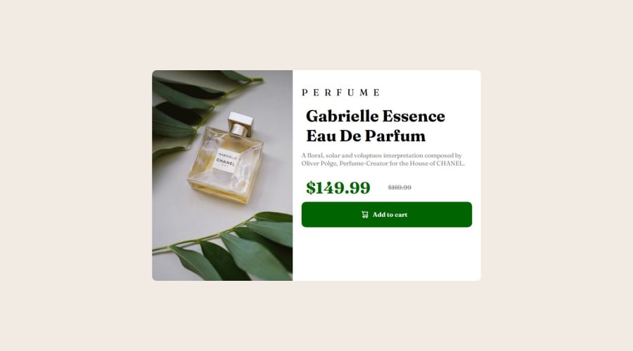


Design comparison

Solution retrospective
Most proud of the naming convention I followed which made everything easier to follow and understand, as well as the use of different images for mobile/desktop
What challenges did you encounter, and how did you overcome them?I managed to get the font to display (finally)
What specific areas of your project would you like help with?I'd like help with the alignment of the grid items for the images. Every time I tried to align the image it would either not take up the remaining grid space or not appear. I had to set its size manually and I don't know why it wouldn't work.
Community feedback
- @YacoubDweikPosted 6 months ago
Hey Sam!
Good job buddy, the only thing here (for now) is that your design gets destorted for Mobile, and this is due to the fact that the img here will be smaller than the other content below it because you gave the img a width 50vw which is not matching with the other elements in the design, to avoid this and to make the life easier when you deal with images do not NEVER EVER put them alone like this in your design, images are displayed as inline by default and they have something called aspect ratio which makes it really hard to align them and play with their dimensions, so you always wrap any image you like inside a div, then you specify all the dimensions you want of that div, then you only give the img one attribute (max-width: 100%) and here you go now you can align it with grid you can do whatever you like with it.
- You can change the display of the image to be block and give it a max-width: 100%, but I still won't recommend that.
Keep it up!
Marked as helpful1

Please log in to post a comment
Log in with GitHub
Join our Discord community
Join thousands of Frontend Mentor community members taking the challenges, sharing resources, helping each other, and chatting about all things front-end!
Join our Discord