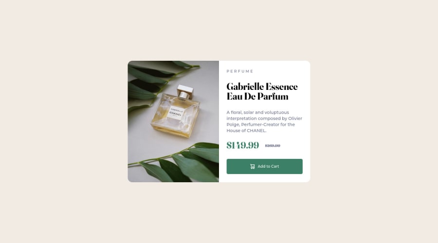
Design comparison
Community feedback
- @Christ-KevinPosted over 2 years ago
I like your code, congratulations.
I especially like your shorthand to define the border radius. I never used it and I think I'll from now. However your code has an accessibility issue and this is due to the fact that you have a p tag inside a button tag. To avoid this kind of problem, you should use a link( or a) tag instead of the button tag. The following link(https://css-tricks.com/buttons-vs-links/) can tell you why it's better to avoid buttons in a project like this. In this other link(https://css-tricks.com/a-complete-guide-to-links-and-buttons/) you'll learn when you can use buttons or when you can use links
Happy coding
Christ
0@cutch14Posted over 2 years ago@Christ-Kevin
Hi Christ, thanks for your feedback, it's much appreciated!
The p tag inside the button was a last minute fix because I completely forgot to add the cart image and ended up cutting a corner. I will go back sometime and rewrite it though.
Have a great day Christ 👍
0
Please log in to post a comment
Log in with GitHubJoin our Discord community
Join thousands of Frontend Mentor community members taking the challenges, sharing resources, helping each other, and chatting about all things front-end!
Join our Discord
