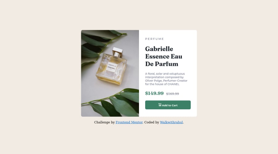
Design comparison
Solution retrospective
This HTML and CSS project I recently completed was a fun. The project involved creating a responsive website that showcased a responsive card element. The main goal of the project was to provide an engaging user experience by presenting high-quality images that were optimized for different screen sizes.
Throughout the project, I enjoyed the process of building and refining the website, and I didn't encounter any major issues. Overall, the project was a great learning experience that allowed me to explore the power and versatility of HTML5 and CSS in creating a responsive and visually appealing website.
Community feedback
- @PipouwPieuwPosted over 1 year ago
Hello @Walkwithrahul, well done completing this challenge!
- Your component looks good on desktop and mobile sizes but roughly from screen width 500px to 600px you can see the card overflows to the left. To fix this you can use a higher breakpoint to display the mobile version.
- To go further, you can add a hover effect with a transition on the cart button.
- Also I don't think the tag <figcaption> should be used anywhere but inside a <figure> element.
You did a good job otherwise, keep going! :)
0
Please log in to post a comment
Log in with GitHubJoin our Discord community
Join thousands of Frontend Mentor community members taking the challenges, sharing resources, helping each other, and chatting about all things front-end!
Join our Discord
