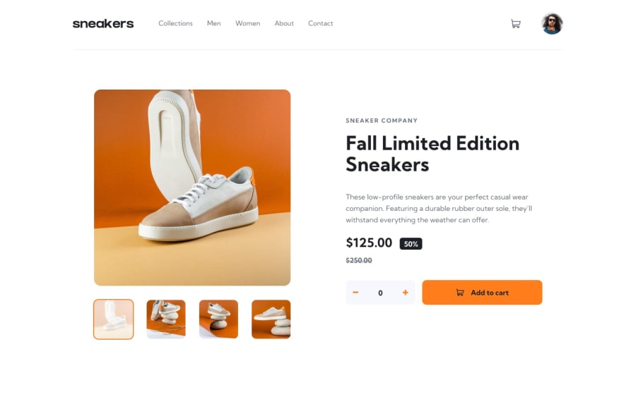
Design comparison
Community feedback
- @TobbyFrancPosted about 1 year ago
Also, how can i make git pages display the react website and not some texts??
1 - @TobbyFrancPosted about 1 year ago
Amazing replica you have there. Just submitted mine too. How were you able to effect the image change on click?
Take:
- Try placing everything in a center and prolly reduce margin to ensure they all fit in a single page. The scroll makes it a distraction on desktop view.
- You can also place a cap on the total number of item that can be added (realistically market have limited stock of same goods)
- The add to cart seem to be replicating the cart items display. You can prolly restrict with a condition? dunno
I personally like your replica...screams attention was well paid to details
Don't forget my question above, pleeeease!
1@Zackweb-aiPosted about 1 year ago@TobbyFranc Since it's a one-page project I added the main functionalities, I know there is a lot to be done. for the scrolling part, in the design picture, I don't think they were on the same page, personally I would fit it in a 100vh. Regarding your question can you elaborate more? did you peruse the code of the product component? I use vercel to put my projects online.
0
Please log in to post a comment
Log in with GitHubJoin our Discord community
Join thousands of Frontend Mentor community members taking the challenges, sharing resources, helping each other, and chatting about all things front-end!
Join our Discord
