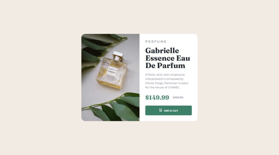


Design comparison

Solution retrospective
The challenges I faced were the image change that I had to do, this change to mobile, I searched on the internet and code that colleagues to know how to do the image change in @media
What specific areas of your project would you like help with?I would like some advice on the area where I change the image on my mobile to know if there is a better practice and to know when I should use rem or em.
Community feedback
- @MarziaJaliliPosted 2 days ago
Nice work!
Some sort of suggestion for you to consider in your next projects
- Instead of using the div element to wrapp the img inside, you could use the picture element.
The picture element is very handy when it comes to multiple images for different screen sizes. It gives you the ability to set different media attributes which can declare the screen size for each source element nested inside.
You can take the code below as an example:
<picture>
  <source
    srcset="(path of mobile image)"  media="(max-width: 30em)"
   />
  <source
    srcset="(path of desktop image)"  media="(min-width: 31em)"
  />
  <img src="(path of the image)" alt="image"/>
</picture>
The src attribute in the img will be the fallback source of the image if the other sources are not found.
Here are some commonly used breakpoints:
- Mobile: max-width: 599px
- Tablet: min-width: 600px and max-width: 899px
- Desktop: min-width: 900px
- Large Desktop: min-width: 1200px
You can change the values to
remoremby doing some math. I used to useemnotpxfor breakpoints butpxis kinda used by pros too.Great work overall, keep up the grid!
😁😁😁
0

Please log in to post a comment
Log in with GitHub
Join our Discord community
Join thousands of Frontend Mentor community members taking the challenges, sharing resources, helping each other, and chatting about all things front-end!
Join our Discord