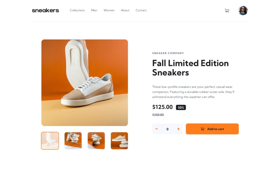
Product Page with HTML, SCSS, and JS
Design comparison
Solution retrospective
It's a lot of (duplicated) code. I want to refactor this in the future.
Community feedback
- @edwinc73Posted 8 months ago
great job on completing the challenge. on first load this looks quite accurate. well done.
The main structure , main, header, footer is present. However for elements that you could interact with you could use a button element or a
<div role="button" tabindex="0">this would allow your elements to be operable by keyboard.In terms of accessiblity, you should try use the lighthouse tab in the inspector. When i used it, it highlighted that some button elements were not big enough. The nav could use some ul li elements with the
role="menubar"and somearia-label:"write label"Most of your js is in the form of eventlisteners. Why not just use a button element and onclick attribute to trigger all these functions?
Good job I can see you spent a long time on it!
0
Please log in to post a comment
Log in with GitHubJoin our Discord community
Join thousands of Frontend Mentor community members taking the challenges, sharing resources, helping each other, and chatting about all things front-end!
Join our Discord
