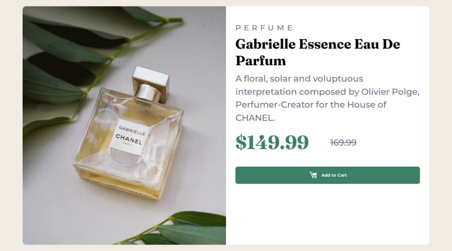
Design comparison
Solution retrospective
Not very proud. Gave up on making it responsive.
What challenges did you encounter, and how did you overcome them?I couldn't center and contain the elements! Don't know why, tried many ways. I started with desktop first then mobile, and I still got the same issues.
What specific areas of your project would you like help with?I want to redo the whole project. If someone can suggest a specific way and methodology that I can follow to match the exact design and improve, please do comment. What are the best ways to center containers for these projects? And how to determine what to use from the beginning.
Community feedback
- @KapteynUniversePosted 6 months ago
Looks like you did it. It is just too big.
If someone can suggest a specific way and methodology that I can follow to match the exact design and improveIt doesn't have to be pixel perfect. It needs an educated eye to determine exactly how big are the gaps, fonts etc. without figma file. But best way i think is to look both mobile and desktop design and determine which things are belongs in which group (like you did here; 1 img container and 1 text container together in a container) and decide when/how to change layouts then start with mobile to desktop.
Also use a css reset everytime
What are the best ways to center containers for these projects?Flex or Grid. Which one to use? It is personal choice most of the times. You can make a 5x5 grid with flex but that wouldn't be efficient ofc.
If you are asking to center whole product card and other challanges, this should do the trick
body {
min-height: 100vh;
 display: flex;
 justify-content: center;
 align-items: center;
}
I guess you had problem with the second col which you can solve using flex and space between.
    div.second-col {
        width: 100%;
        padding: 30px !important;
        overflow: hidden;
        display: flex;
        flex-direction: column;
        justify-content: space-between;
    }
For
div class="container"i think you can use article tag. The <article> tag specifies independent, self-contained content. An article should make sense on its own and it should be possible to distribute it independently from the rest of the site.In your code you commented that picture tag doesn't work but looks like it is working, but i think you can delete source element with the mobile picture and switch src attribute of the img tag to mobile picture. With this way card will display mobile picture until min-width of 768px. In your code it displays desktop picture then switches to mobile at 320px then switches to the desktop again at 768px.
Also for this project i think only 1 media query is enough, which is i think needs to match with the picture elements min/max width size.
Lastly Kevin Powell made a video for this challenge. You can check that too.
Marked as helpful0@7bibiPosted 6 months agoThank you very much for your feedback! I tried some of the things you mentioned and it made things easier for me. Also for the picture, I tweaked it a bit and figured that changing the order made it work after I commented. I finished doing it again if you have time you can check how I did this time. I will now watch the video, I gave myself time to try things out on my own. I'm sure it will be super helpful so I appreciate it!!.@KapteynUniverse
0
Please log in to post a comment
Log in with GitHubJoin our Discord community
Join thousands of Frontend Mentor community members taking the challenges, sharing resources, helping each other, and chatting about all things front-end!
Join our Discord
