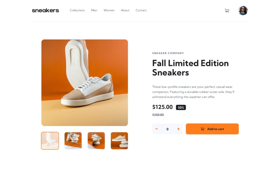
Design comparison
Solution retrospective
kindly please check this design and provide me feedback so I can improve myself more
Community feedback
- @BilalSalmiPosted about 2 years ago
Hi Usman, good job! your design is good but still need to be optimized
-
- Accessibility recommadations*
-
Your web page should contain just one <main> element
-
consider using Html semantic elements like <section> <article> <header> <nav> <footer> in your page.
Read more about them here.
- ID Attribute
- "id" attribute must be unique which means it shouldn't be repeated if wanna for example apply the same style for two elements, in this case you have to use "class" instead of "id".
Read more about it here.
Marked as helpful1@usmanahmedkhan09Posted about 2 years ago@BilalSalmi Thanks brother I'm working on these in the next build I will try to clear all of these
0 -
- @NizarMjrPosted about 2 years ago
Nice work @Usman especially in the design part You just need to focus on the Javascript part to make your project more dynamic and to reach the required target Happy Coding
Marked as helpful0
Please log in to post a comment
Log in with GitHubJoin our Discord community
Join thousands of Frontend Mentor community members taking the challenges, sharing resources, helping each other, and chatting about all things front-end!
Join our Discord
