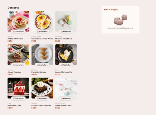
Design comparison
Solution retrospective
I am mostly proud of my use of css grid and how I was able to insert the images from a JSON file. I am also proud of all the things I implemented using JavaScript.
What challenges did you encounter, and how did you overcome them?First, I was mostly challenged with the aspect of deleting an element from the cart but later on, I was able to find my way around it and finish it up. Second, the aspect where once a user clicks on the "Add to Cart" button and they'll be able to increase the amount of item on the cart was especially difficult in terms of finding the item in the cart and increasing the amount on it as well as increasing and decreasing the total cart amount.
What specific areas of your project would you like help with?the aspect where I would be able to increase/decrease specific items by clicking their buttons
Community feedback
- @MohammedOnGitPosted about 2 months ago
Hello KONY05!!!
Congratulations on completing this challenge. Your HTML structure is well-organized and visually appealing for the "Product list with cart" concept. Here are a few suggestions and minor corrections:
- Optimize Accessibility and Image alt Attributes Ensure that all images have descriptive alt attributes for better accessibility. For instance:
<img src="assets/images/image-waffle-desktop.jpg" alt="A waffle with berries"> <img src="assets/images/illustration-empty-cart.svg" alt="Empty cart illustration"> <img class="modal_thumbnail" src="assets/images/image-waffle-thumbnail.jpg" alt="Thumbnail of waffle image">
- Meta Tags and Comment Clarity Add a description meta tag for better SEO and sharing:
<meta name="description" content="A product listing for desserts with an interactive cart.">
- Use Semantic HTML for Structure Consider adding more semantic HTML elements to improve accessibility and structure:
Replace the div with section in the cart and food-items areas.
<section class="cart">...</section> <section class="food-items_container">...</section>
- Headings Hierarchy Maintain proper heading hierarchy for accessibility. For example, after <h1>Desserts</h1>, use <h2> or <h3> for the item names within the grid.
<h3 class="food_category">Waffle</h3> <h2 class="food_name">Waffle with Berries</h2>
- Script Placement Since you are using the defer attribute, your script will already load after the HTML. If not, move your
Marked as helpful1
Please log in to post a comment
Log in with GitHubJoin our Discord community
Join thousands of Frontend Mentor community members taking the challenges, sharing resources, helping each other, and chatting about all things front-end!
Join our Discord