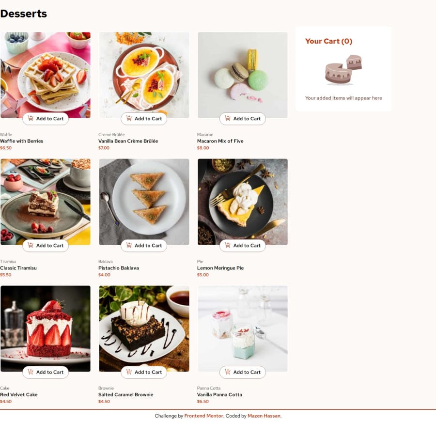
Product list with cart using React | Tailwind
Design comparison
Solution retrospective
I am really grateful that I kept going till the end, even though I got stuck for an extended period and took longer than expected to finish the challenge but I finally did it.
I received a lot of help along the way, and I went through many rounds of refactoring and cleaning up messy code. Despite the time it took, it was a great learning experience.
What challenges did you encounter, and how did you overcome them?I faced difficulty with the approach of mapping list and passing props with unique key and as result I had all the code separate and meaningless, to overcome it I mapped the product data directly into `` as the child allowing for easy prop passing, then created 3 functions in App.jsx to handle all cart updates.
I am open for any feedback offered, I already asked for enough help from community and I just need to get a better idea on how React works and read docs more often. Thanks for taking a look at my solution :)
Community feedback
- @falloumacbookPosted 9 months ago
Nice work as always man, it would be great if you move the cards a little bit left.
1@Mazz100Posted 9 months ago@falloumacbook Thanks man I appreciate it. I got my content as a grid and placed in center although I feel it looks a little on the left. Do you mean to move it a little further ?
0
Please log in to post a comment
Log in with GitHubJoin our Discord community
Join thousands of Frontend Mentor community members taking the challenges, sharing resources, helping each other, and chatting about all things front-end!
Join our Discord
