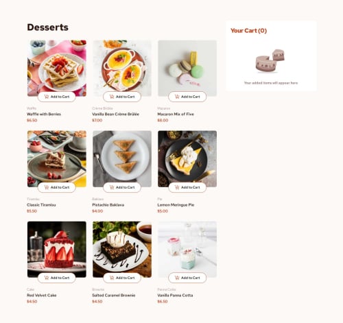
Product List With Cart Solution 🎯 [REACT, SCSS, BEM]

Solution retrospective
I was surprised how easy it was to build this with React, I don not know what kind of mess it would have been If I had to do it Plain JS.
Things I would do next time
1.) I wanted to add some animation to the click and hover effects of the component, but It was taking a lot of time, so I dropped it.
2.) I wanted to add a button that would take you to cart section on mobile screen coz, in design the cart section was very below and you have to scroll it down all the way to get there, that button would be visible on all the screen except when cart section was showing.
3.) But even after working on it for more than 2 hours, I could not get it done, so I dropped it as well.
What challenges did you encounter, and how did you overcome them?I think It was to get the Component structured and making some Component reusable. Also deciding which Component will be used in which part of the project.
All I did is to just
- Open the design file Image
- And Painted Different Component Based on that
- You can see it here Open
Hmm There is nothing specific, But I would to get some feedback, because My Solution is not the best at all.
Please log in to post a comment
Log in with GitHubCommunity feedback
No feedback yet. Be the first to give feedback on Rahul Kumar's solution.
Join our Discord community
Join thousands of Frontend Mentor community members taking the challenges, sharing resources, helping each other, and chatting about all things front-end!
Join our Discord