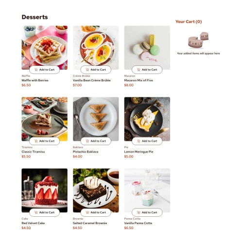
Submitted about 1 year agoA solution to the Product list with cart challenge
Product List with Cart main (React Vite)
react, vite, tailwind-css
@Zeke-Cachi

Solution retrospective
What are you most proud of, and what would you do differently next time?
For this project, I wanted to dust off my React knowledge, since it was some time since the last time i did any code with it. I like the simple yet usable cart, and overall how it turned out (disclaimer: i just eyeballed the design, since i only had the image to copy it)
What challenges did you encounter, and how did you overcome them?Not a lot of challenges really, just didn't remember how to deploy a React Vite project to Github pages hah
Code
Loading...
Please log in to post a comment
Log in with GitHubCommunity feedback
No feedback yet. Be the first to give feedback on Zeke-Cachi's solution.
Join our Discord community
Join thousands of Frontend Mentor community members taking the challenges, sharing resources, helping each other, and chatting about all things front-end!
Join our Discord