Design comparison
SolutionDesign
Please log in to post a comment
Log in with GitHubCommunity feedback
- P@michael-schlueter
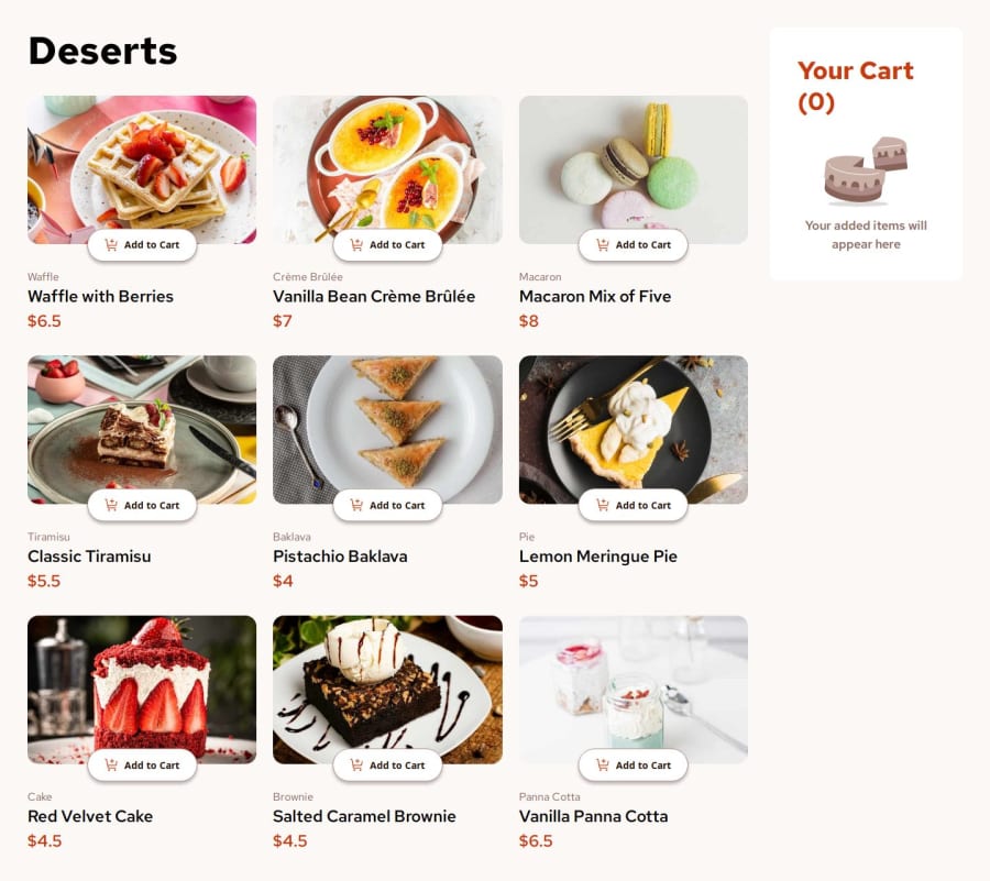
Hi there, great job finishing the project. It looks really good. You implemented the design quite well. In particular I like the use of shadows on the buttons. Also everything works just as expected. There are a couple of things I picked up looking at your site:
- I'm not sure if you plan to add it later on but the modal for confirming the order is missing.
- Like I said the layout in general looks great but the cart could be a little bit bigger on desktop. It's a bit squished, especially compared to the product list. I find using CSS Grid for laying things out in that manner particularly helpful.
- You may also want to look at the images for the desserts. There are multiple versions of the images provided (desktop, tablet, layout). The <source> element can help in that regard. The user gets to see the image which is best fitting for the device he is using.
- Looking at accessibility, I'm currently not able to navigate with the keyboard to the buttons for increasing/decreasing the quantity of the items. You may want to make those buttons focusable.
All in all great job, though. Keep on coding!
Marked as helpful
Join our Discord community
Join thousands of Frontend Mentor community members taking the challenges, sharing resources, helping each other, and chatting about all things front-end!
Join our Discord
