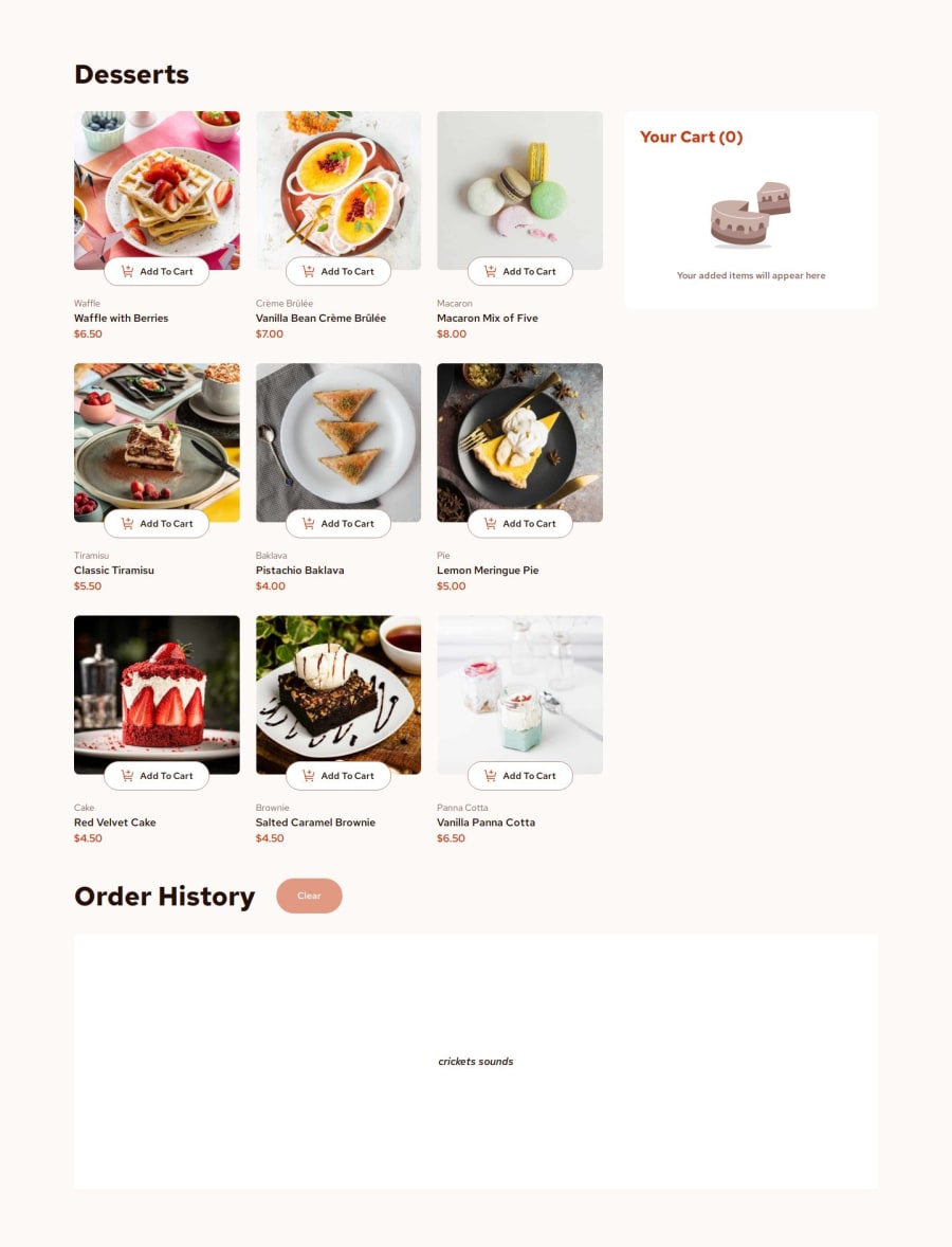
Design comparison
Solution retrospective
I love the sticky cart that slides along on the desktop viewport. A very simple thing but it feels amazing.
What challenges did you encounter, and how did you overcome them?I had a lot of trouble setting up testing environments because Astro is weird and does some stuff different, at the end, I did have a good enough configuration for tests to go through. At first, I wanted to do this with SolidJS, which is just React but cleaner, but a lot of server-rendering stuff got in the way of vitest and I got annoyed so Vue came back :(
Community feedback
- @dylan-dot-cPosted 21 days ago
Wow!!
Well done, with everything the layout, functionality, the tests and the order history feature(which is a nice addon). You seem really good at these. I also loved that you used vue for this challenge(I used it as well). I must agree that the sticky cart is a fun feature! I used pinia for my state management here.
You seem to be using a variety of frameworks and thats really cool and you also writing tests(I need to do so too...rip) but overall you are great at these!
One thing I want to ask, for the order modal, what I did was make the order-items container scrollable and not the whole modal, so that way the modal will have a fixed max-height even when the user buys all of the items. I see you make your modal scrollable and the scrollbar is visible even when there isn't that much items. So i would just like to know your thoughts on this.
Also if you would be kind to look at my solution and tell me what I can do better I would appreciate it. Also out of all the frameworks you have used, which one is your favorite?
Marked as helpful1
Please log in to post a comment
Log in with GitHubJoin our Discord community
Join thousands of Frontend Mentor community members taking the challenges, sharing resources, helping each other, and chatting about all things front-end!
Join our Discord