Product List | Cart


Design comparison

Please log in to post a comment
Log in with GitHubCommunity feedback
- @khatri2002
Hi! The developed solution looks amazing! It is very well aligned with the given design reference. Below are some suggestions from my side:
1. Use Button Element Insetad of Div:
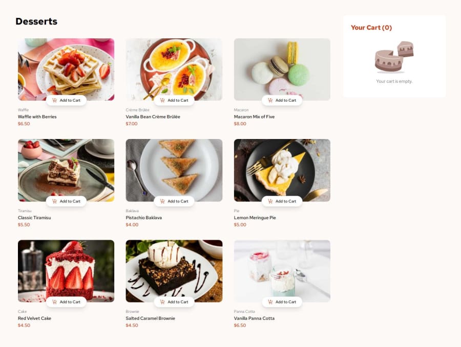
The
Add to Cartelement should be a<button>instead of a<div>. Similarly, the<div>for increment/decrement should also be replaced with a<button>.Why:
- Buttons are semantically correct for actions and improve accessibility.
- They automatically support keyboard navigation and focus styles.
- It aligns with web standards, making your code cleaner and easier to maintain.
Additionally, Remove the
cursor: pointer;from the surrounding container (div) of increment/decrement, as only the increment and decrement buttons are clickable, not the entire container.2. Update Cart on 'Start New Order':
Clicking the
Start New Orderbutton closes the modal but should also reset the cart to empty. This aligns the functionality with the intent of starting a new order.3. Handle Modal Overflow for Smaller Screens:
When all 9 products are added to the cart, the modal extends beyond the screen height on smaller desktop resolutions.
Add
max-heightandoverflow: auto;orscrollto the modal to ensure it is scrollable without breaking the layout.4. Tablet Layout Fix
On tablet devices like the iPad Mini (768 x 1024) and iPad Air (820 x 1180), the
Add to Cartbutton appears larger than the product card.Adjust the button size and ensure it maintains proportionality with the product card on these resolutions.
Consider these suggestions positively. Overall, a very good solution has been developed.
Keep up the great work going! Happy Coding! 🚀

Join our Discord community
Join thousands of Frontend Mentor community members taking the challenges, sharing resources, helping each other, and chatting about all things front-end!
Join our Discord