

Design comparison

Solution retrospective
It was really fun to build a page with state using React. It is the first project where I used state.
What challenges did you encounter, and how did you overcome them?I had a lot of trobule making the dialog on mobile version the same as the design. I endend up making it a little bit different. I used inset-0 on the dialog but it wasn't placed on the entire viewport. I didn't understand why. Instead I had a lot less trouble with vite deploying the site with github pages so it was a real relief.
What specific areas of your project would you like help with?Any help on the dialog, how to make it look similar to the design is really appreciated. It didn't respond like earlier projects where I built the mobile nav with ease using a fixed element and using inset-0. I didn't understand why it didn't work this time. Any other suggestion on my approach with state or anything else is really appreciated. Thank you :)
Community feedback
- P@niuguyPosted about 2 months ago
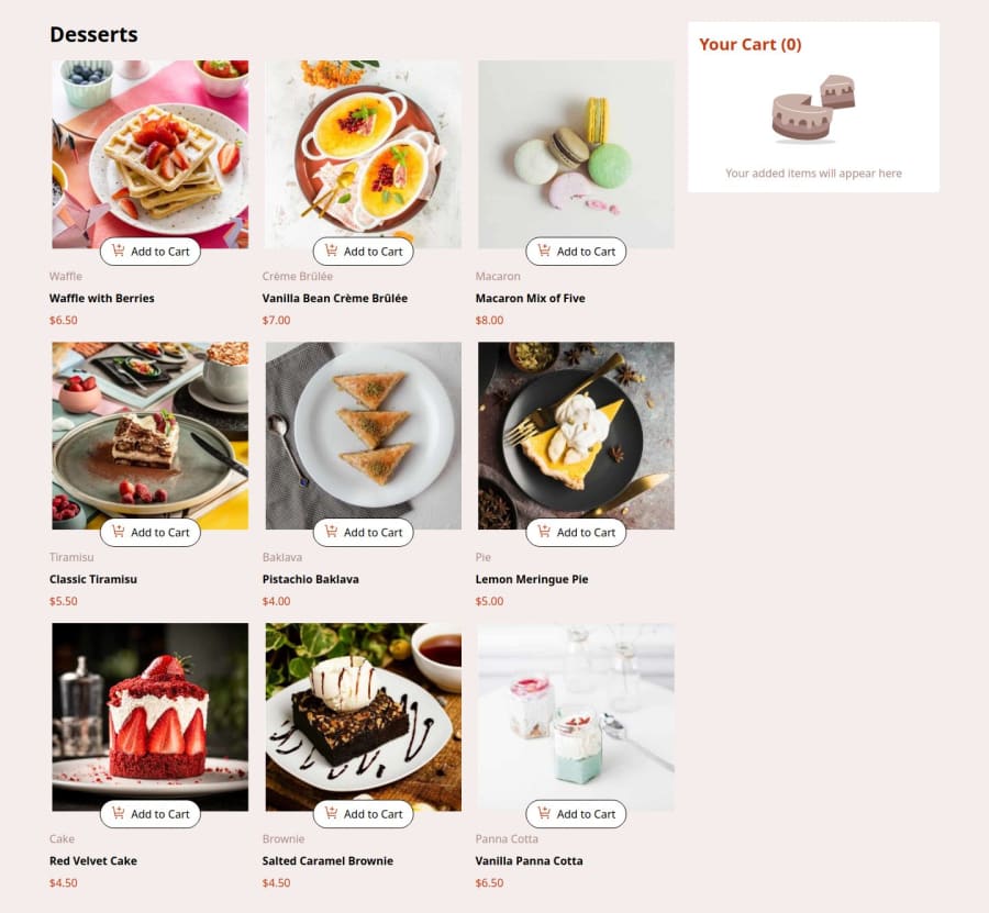
The solution overall looks excellent. I noticed a few minor issues to address: on desktop, the '+' and '-' icons on the 'add to cart' button appear to be switching positions. Additionally, it would improve user experience if the confirm order modal could be dismissed by clicking anywhere outside the modal itself.
After all, congratulations on finishing this one! this is not easy, isn't it?
Marked as helpful0P@ArcloanPosted about 2 months ago@niuguy Thank you :) The tip on the user experience was helpful. I noticed the switching of the images position but for this small project I didn't bothered making a commit only to adjust the position of the two images. The functionality remained the same.
0

Please log in to post a comment
Log in with GitHubJoin our Discord community
Join thousands of Frontend Mentor community members taking the challenges, sharing resources, helping each other, and chatting about all things front-end!
Join our Discord