Product landing page using shadcn/ui


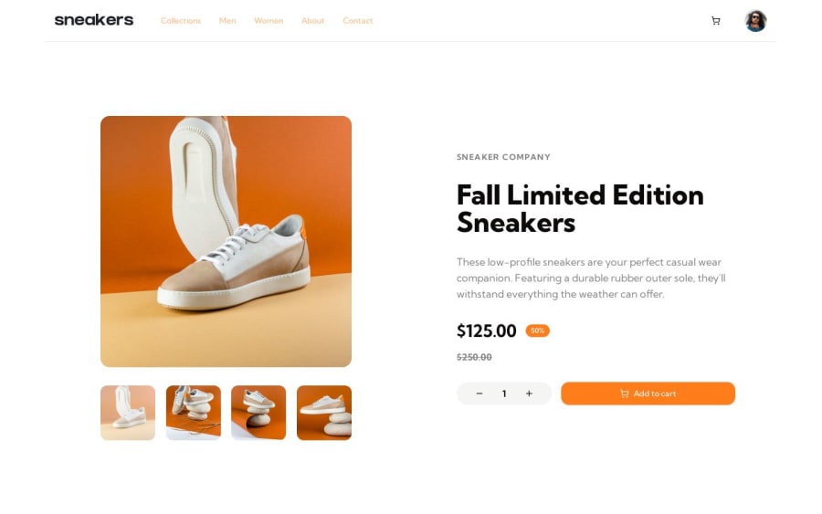
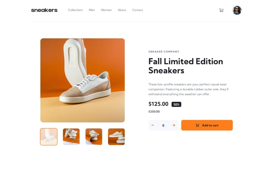
Design comparison
Solution retrospective
I'm mostly proud of the planning, did a rough sketch about how the page would be structured and what components/states would be needed. That helped me to think about the implemenation rather than to always think about the high level design.
This also helped me decide if shadcn/ui would be a good fit for the challenge (minimize the risk to create components from scratch).
The only risk I saw during the planning was that I didn't know how easy it would be to customize "shadcn/ui" components. And the lack of a "number input" component.
What challenges did you encounter, and how did you overcome them?Without the figma design, making it "pixel perfect" is not really the goal, however I tried to make the layout as close as the design as possible.
Shadcn/ui made it fairly easy/fast to get a working prototype working. However customizing was a bit trickier (but possible). If I would spend more time on the challenge I would probably look into how the "shadcn/ui" components are designed/built and perhaps try to create more "variants".
I usually just dumped some tailwind classes on the "root" component, in order to override the styles, but I don't think this is the prefered way when you need to make heavy visual changes.
This was the case when I tried to have the "thumbnails images" as toggle buttons.
What specific areas of your project would you like help with?Not really looking for specific feedback, but it would be fun/interesting to know about what others think about shadcn/ui
Please log in to post a comment
Log in with GitHubCommunity feedback
No feedback yet. Be the first to give feedback on Kim Fransson's solution.
Join our Discord community
Join thousands of Frontend Mentor community members taking the challenges, sharing resources, helping each other, and chatting about all things front-end!
Join our Discord