Not Found
Not Found
Not Found
Not Found
Not Found
Not Found
Not Found
Not Found
Not Found
Not Found
Not Found
Not Found
Not Found
Not Found
Not Found
Not Found
Not Found
Not Found
Not Found
Not Found

Submitted

Product landing card using CSS grid

@neew18

Desktop design screenshot for the Product preview card component coding challenge

This is a solution for...

  • HTML
  • CSS
1newbie
View challenge

Design comparison


SolutionDesign

Solution retrospective


Hi! This is my solution for the Product preview card challenge. I am still struggling to make those card center I guess but I am working on it. And I have a problem on my code which I can't seem to pin point what it is. Because it is working on my codepen. It is like when I deployed the page the responsive apart is not working and it is still at the mobile version. Please help me find what it went wrong and any other suggestions are welcome!!

Community feedback

Muhammadh 1,140

@Mr-jaw

Posted

Hello 👋

Well done on completing it

some tips to improve your code

HTML 📰

  • for headings avoid using
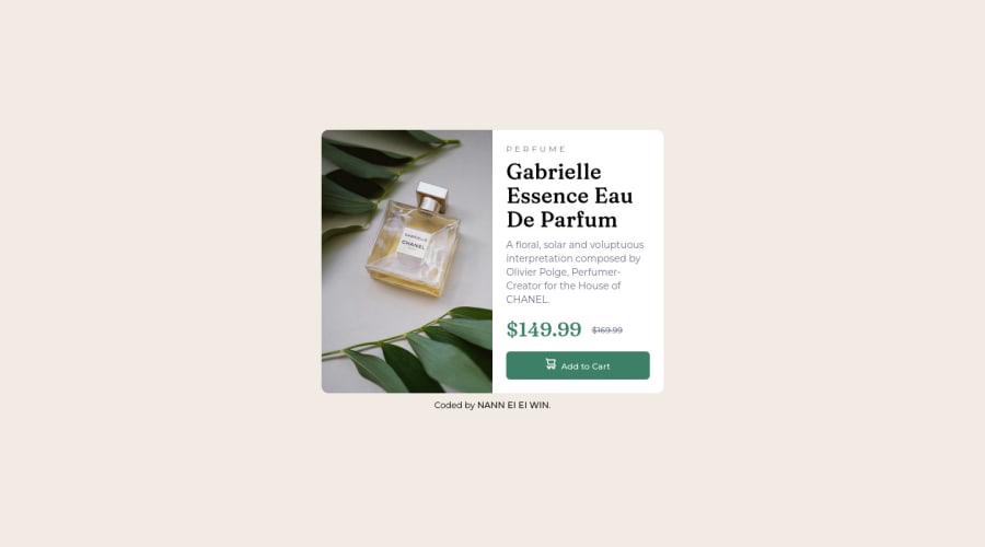
 <p> tags. In <p id="heading-small">Perfume</p> replace the <p> tag with a <h1> , and replace <h1>tag in <h1>Gabrielle Essence Eau De Parfum</h1> with a <h2> tag. So you will have a top-level heading which is <h1> and a second-level heading <h2> which will greatly improve accessibility.

  • avoid using <p> tag to display short texts(i.e <p id="price1">$149.99</p> and <p id="price2">$169.99</p>). Since the <p> tag is used to display descriptive text. Rather use <em>, <strong> or <small> tags. This will also improve accessibility.

the above-mentioned are semantic HTML and accessibility issues

Learn more about Semantic HTML here

Learn more about Accessibility here

CSS 🌈

  • It is always considered good practice to use CSS custom variables. They will make life a lot easier as a web developer. learn more about it here

Other than that all looks great 🔥, you have used relative units which is great for responsiveness, and used a better approach to change images on mobile and desktop view

I hope you find this helpful 😄

KEEP IT UP

Marked as helpful

0

@neew18

Posted

@Mr-jaw Thank you so much.. I will read them and fix them all.

0

@aykutminikli

Posted

Hi, congratz on completing the challenge.

The thing with your responsive problem is from what i see you made your media like this @media only screen and (min-width: 1440px). This makes your container to stay like in mobile version until the screen reaches 1440px. You should try lower widths like 500px or 600px.

What is mean is @media only screen and (min-width: 600px) or @media only screen and (min-width: 500px) would be a better choice for breakpoints in this project.

Hope this was helpful.

Marked as helpful

0

@neew18

Posted

@aykutminikli Thank you so much. It works now after I fixed it as you said.

0

Please log in to post a comment

Log in with GitHub
Discord logo

Join our Discord community

Join thousands of Frontend Mentor community members taking the challenges, sharing resources, helping each other, and chatting about all things front-end!

Join our Discord