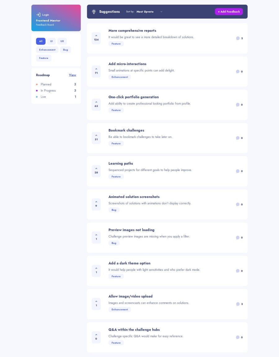
Design comparison
Solution retrospective
One of the highlights of working on this project was using Tailwind to make the website look good and work well. It was really enjoyable to see the design come to life on the screen.
In the future, I plan to organize my work better so I can use the same parts across different pages, which will help me avoid doing the same thing many times. ヾ(≧▽≦*)o
What challenges did you encounter, and how did you overcome them?the toughest part of this project was figuring out how to set up the comments section. At first, I was pretty lost, especially since it was my first time using Drizzle ORM and Neon for the database.
But I got through it by looking up information and studying the guides for both tools.
All in all, it was a great time learning something new! ( •̀ ω •́ )✧
What specific areas of your project would you like help with?I’m eager to dive deeper into the tools I’ve used, like Next, Neon, and Clerk, and I’m also keen to learn about making websites easy for everyone to use!
I’d love to hear your thoughts on my project! Any feedback or a little cheer would be great! (≧∇≦)
Community feedback
- @alexander-hergertPosted 8 months ago
Nice job. Very impressive. It seems I am not able to add new Feedback under the topics UI and UX. You maybe want to look into this :) No other issues found when I was quick testing with Chrome.
Marked as helpful1@BriuwuPosted 8 months ago@alexander-hergert Oh you're right! It was because of the way I set up my zod form schema.
category: z.string().min(3, {
    message: "Can't be empty",
  }),
I've fixed it already, thanks for the feedback!
1
Please log in to post a comment
Log in with GitHubJoin our Discord community
Join thousands of Frontend Mentor community members taking the challenges, sharing resources, helping each other, and chatting about all things front-end!
Join our Discord
