

Design comparison

Solution retrospective
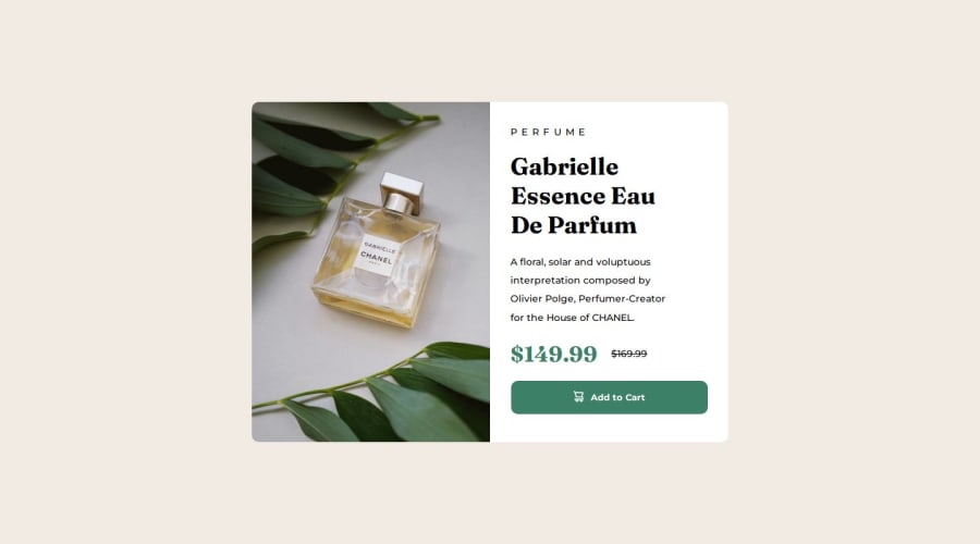
I used fixed heights and widths for testing. Both designs.
What challenges did you encounter, and how did you overcome them?This time it was more easy.
What specific areas of your project would you like help with?none
Community feedback
- @majdi-nejiPosted 3 months ago
Hi @danielseverian well Done i think your solution looks great for the most part it's just the layout needs a little of adjustments on the mobile view like changing the width and height to percentages so it becomes more responsive and the horizontal scroll disappear,maybe adding one more break-point for small phones decreasing font sizes.. also i think it's better to use the img tag in html instead of using it as a background on css when the image serves a purpose as content and use it as a background when it's only for decorative purposes i hope this was helpful.
0


Please log in to post a comment
Log in with GitHubJoin our Discord community
Join thousands of Frontend Mentor community members taking the challenges, sharing resources, helping each other, and chatting about all things front-end!
Join our Discord