Not Found
Not Found
Not Found
Not Found
Not Found
Not Found
Not Found
Not Found
Not Found
Not Found
Not Found
Not Found
Not Found
Not Found
Not Found
Not Found
Not Found
Not Found
Not Found
Not Found

Submitted

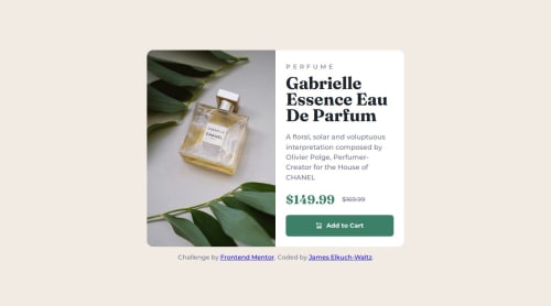
Product Description Card with Mobile and Desktop Layout

@ElkuchWaltz

Desktop design screenshot for the Product preview card component coding challenge

This is a solution for...

  • HTML
  • CSS
1newbie
View challenge

Design comparison


SolutionDesign

Solution retrospective


What are you most proud of, and what would you do differently next time?

I'm proud that I was able to get my design to match well with the mobile and desktop prompts using the media query, which I hadn't used before. I hope next time I am able to do a project like this faster.

What challenges did you encounter, and how did you overcome them?

Media queries, selecting different images based on the media query, and using different alignments within the same container were all new for me. I read articles linked by Frontend Mentor, googled some specific questions, and perused the code of other solutions to try out different ways to incorporate the code in my design.

What specific areas of your project would you like help with?

Inefficiencies in the code Best practices that are missing or done incorrectly

Community feedback

@RogerTito455

Posted

Hey there, well done!

My feedback:

HTML:

Great use of the <main> tag: You've correctly wrapped the core content of your page, which is great for accessibility and semantic structure.

Alt Text Improvement: The alt text you've used is descriptive, but it could be more concise and focused on its purpose. Consider simplifying it to something like "Gabrielle Essence Eau de Parfum bottle" since the image visually represents the product. If the image is a link, mention where it leads.

Use of <button> inside <a>: While it's generally fine to wrap a <button> inside an <a> for styling purposes, it's better to apply the styles directly to the <a> tag when it's used as a button. This helps keep your HTML semantically correct, since <button> is usually for form elements or JavaScript actions, and <a> should handle navigation.

Ensure unique IDs: If you plan to add IDs to elements in the future (not currently in your code), make sure each ID is unique on the page. Using classes for styling, as you’ve done, is a better practice when multiple elements share the same styles.

CSS:

CSS Reset: You've correctly implemented a CSS reset, which is excellent for ensuring consistency across browsers. You could consider using a more comprehensive reset like normalize.css for additional cross-browser compatibility.

Font Family: You have a good handle on specifying fonts. Just a small suggestion: it’s good practice to add a generic font family at the end of your font-family declarations as a fallback, like you did with sans-serif.

Padding on the body: You've included a margin on main, which is good. Adding a bit of padding to the body (e.g., padding: 1rem;) can ensure that content doesn’t touch the viewport edges on smaller screens, providing better aesthetics and readability.

Image Responsiveness: You’ve done a great job ensuring images are responsive with max-width: 100%. Additionally, setting display: block; on images (as you did) helps remove any unwanted whitespace beneath images, which is a common issue.

Flexbox Usage: Your use of Flexbox in the card layout is spot on. It makes the layout responsive and easy to manage. However, consider using gap in the .price container instead of margin-left on .srp for spacing between the elements, as it’s more straightforward and keeps spacing consistent.

Mobile-first Design: It’s great that you’re using media queries effectively! Remember, a mobile-first approach is often recommended—starting with styles for smaller screens and adding media queries for larger screens.

Consistency in Units: You’ve used rem units for most sizing, which is excellent for scalability. However, you might want to ensure that all sizes are consistent, even in media queries (e.g., use rem instead of px for breakpoints if possible).

Hover States: The hover effect on your button is a nice touch. Consider adding subtle transitions (e.g., transition: background-color 0.3s ease;) for smoother visual feedback.

Specificity in Selectors: You’ve already used specific class selectors, which is good for maintainability. Avoid deep descendant selectors like .text-container h2 (though you haven’t used this specifically), as they can become hard to manage in larger projects.

Marked as helpful

0

@ElkuchWaltz

Posted

Thank you so much, @RogerTito455 ! This gives me a lot of good information to incorporate in the CSS and HTML here and in future projects! I appreciate you taking the time to write such clear and helpful feedback.

0

Please log in to post a comment

Log in with GitHub
Discord logo

Join our Discord community

Join thousands of Frontend Mentor community members taking the challenges, sharing resources, helping each other, and chatting about all things front-end!

Join our Discord