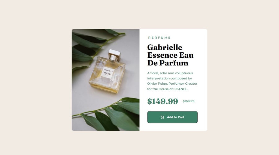
Product Component Preview card with HTML and CSS


Design comparison

Solution retrospective
Hi ✌️ I made this project with HTML and CSS and used mainly flexbox
What I am proud of is that I was able to finish this under 1and half hour almost without much trouble
What challenges did you encounter, and how did you overcome them?What I had trouble is when I styled the perfume I did not really have an idea on how to do it so I ended up using span hope I am right would love a review on this 😊
What specific areas of your project would you like help with?I would like help with how to style the perfume text line I used span to it is there any better way?
Thanks 😊
Community feedback
- @porumbachanovPosted 6 months ago
Hi, in response to your question you asked on my solution, I'm not sure I can give you proper feedback, however I can tell you what I did.
Basically what I did was have one parent div in which I have two children divs, one for the image and one for the text content. I set the container to 45rem (for desktop) and the height to 100%, that way I let the content inside the parent container dictate the height. And of course I'm using flexbox for the layout. So basically for the whole size thing, I just have a fixed width for desktop and mobile and the height is dictated by the content, so the margins, font sizes, etc all play a part in the height.
Dunno if I made sense but hope this helps.
P.S. You can style the spacing in the "perfume" text without using
<span>by usingletter-spacing::)Marked as helpful1@induwara-thisarinduPosted 6 months ago@Vrondir Thank you very much for taking your time to reply and it did help me
1 - @danielmrz-devPosted 6 months ago
Hello there!
Congrats on completing the challenge! ✅
Your project looks great!
I have a suggestion about your code that might interest you:
📌 You can use the
<picture>tag when you have different versions of the same image.Using the
<picture>tag will help load the correct image to the user's device, saving bandwidth and improving performance.Example:
<picture>
    <source media="(min-width: 768px)" srcset="{desktop image path here}">
    <img src="{mobile image path here}" alt="{alternative text here}">
</picture>
I hope this helps!
Other than that, excellent work!
Marked as helpful1


Please log in to post a comment
Log in with GitHub
Join our Discord community
Join thousands of Frontend Mentor community members taking the challenges, sharing resources, helping each other, and chatting about all things front-end!
Join our Discord