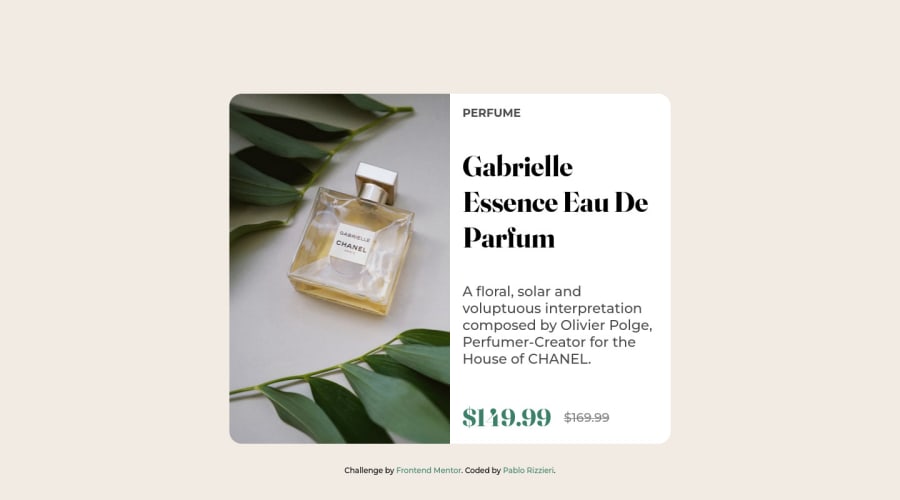
Design comparison
Solution retrospective
My difficult was able to use correctly or manipulate the display grid and another thing that was very hard to me was make the website responsive.
But at the end was very satisfiying be able to make things right and finish the challenge.
Community feedback
- @correlucasPosted over 2 years ago
👾Hello Pablo, congratulations for your new solution!
Your solution is great and everything is fine, there's only a small issue due the
overflow: hiddenyou've used to round the image borders that are cropping the content when the container scales, note that the button disappear before the component become mobile.To fix that is better you add
border-radiusto the image and removeoverflow: hidden. Otherwise you'll have this problem with the content disappearing in the bottom part of the text column.👋 I hope this helps you and happy coding!
Marked as helpful0 - @iamenochleePosted over 2 years ago
first challenge here! congrats. here are my observations. introduced the media query later.(min-width: 60em, seems fair) reduce the font-size of the text, this way your button will be able to show up, set
.container { overflow: hidden }this way you can work with the space and apply adequate margins and font-sizes. For the button, use a button tag '<button type="button">...Buy Now</button>then apply width and height, you can also use an <a> tag to achieve it with paddings, you will have to apply adisplay: inline-block` if you use an <a> tag for the buy now, i will suggest you use a button tag.great job done with the image responsiveness. Also you should start using responsive units like rem and ems instead of px, read more here Rem an Em
Marked as helpful0
Please log in to post a comment
Log in with GitHubJoin our Discord community
Join thousands of Frontend Mentor community members taking the challenges, sharing resources, helping each other, and chatting about all things front-end!
Join our Discord
