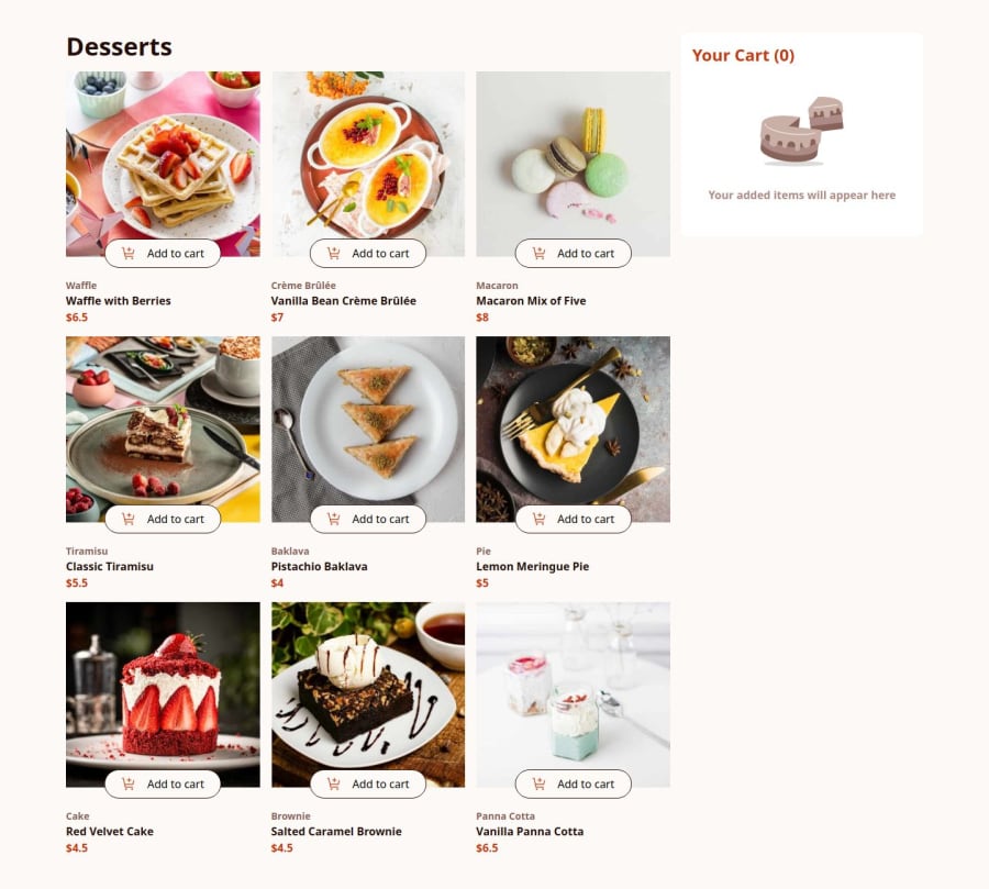
Design comparison
Solution retrospective
any tips to improve
Community feedback
- @khatri2002Posted 2 months ago
Hi @Sandaruwan7056!
The developed solution looks great, and the responsiveness is well-handled!
However, there's one thing that needs to be fixed according to the design reference.
In the mobile resolution, when the
confirm orderbutton is clicked, the modal appears centered on the screen. According to the design reference, the modal should actually be aligned at the bottom of the screen in mobile resolution. To achieve this, you can modify the alignment for the modal's wrapper div on a specific mobile breakpoint.Update the CSS to change the alignment for mobile resolutions. Use a media query to adjust the
align-itemsproperty for the modal wrapper, setting it toend(aligned at the bottom) instead ofcenter.
Great work so far! Keep going! 🚀
Marked as helpful0@Sandaruwan7056Posted 2 months ago@khatri2002 Thank you for pointing it out ill update the solution
1
Please log in to post a comment
Log in with GitHubJoin our Discord community
Join thousands of Frontend Mentor community members taking the challenges, sharing resources, helping each other, and chatting about all things front-end!
Join our Discord
